Boosting GTV through
feature activation
2024
Website
Midtrans is a payment gateway that is part of Gojek. It provide businesses with an easy payment for their customers & all the financial tools needed to run the business. Currently, we are thinking of ways to boost our GTV & turns out our features adoption is considered low, hence allowing users to easily activate our feature will allow them to be more productive & generate more GTV for us.

Who are the users?
Midtrans users are varied from individual to enterprise businesses who might manage more than 1 merchant under them.

What are the goals?
Provide easy ways to activate our additional feature, in order to allow merchants to be more productive & generate more revenue.

Who far is the scope?
Designing all the flow that is general enough to be scalable for all features. But for the first MVP, It will be implemented for disbursement feature only.

What are we solving?
Manual & un-unified feature activation flow, cross selling capabilities & operational efficiency.
Design processes
To ensure that I can produce effective designs for this project, multiple processes and steps are taken. It includes defining the initial requirements to finally coming up with the polished final outcome.

Setting up requirements
Defining problem statement
Defining high level solution & JTBDs
Defining success metrics

Explorations
Initial design approach
Wireframing

Finalization
First UI draft
Showcase & feedbacks gathering
Final UI design
Setting up
Requirements
Problem statement

Manual feature activation process
There is no option for merchants to activate the feature by themselves, except they have to do it manually by requesting it to their contact person.

Limitation to cross-sell valuable features
Merchants will never know what additional features that they are eligible of using, unless their contact person suggesting it to them for activating it.

Missing out the potential GTV
Due to lack of awareness about the available features and how not user friendly it is to activate it. Less merchants are using the actual features which is resulting in missing many potential GTV that can be generated from it.
High level solution & objectives

Product side:
More accessible & unified feature activation.
Enhance merchant experience.
Increase feature adoption rate.
Business side:
Improve our operational efficiency.
Allow us to grow new revenue stream.
Strengthen competitive advantage against the competitor
Jobs to be done
As merchants.
I want to easily discover Midtrans's feature that I have not used for yet.
So that I know where and how I can activate it.
As merchants.
I want to be able to activate the feature easily at any time by myself.
So that the process can be faster witout the need of any assistance.
As merchants.
I want to be able to continue the activation at any time.
So that i don't need to re-upload the documents again.
As merchants.
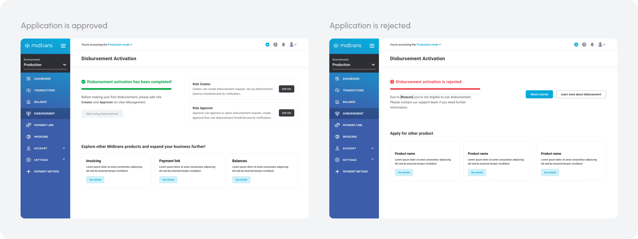
I want to know if my activation get rejected or approved.
So that i know if i am now ready to use the feature or not.
As merchants.
I want to be able to try out the feature and explore more about it.
So that i can understand the value that it can provides
to my business and become more encourage to use the feature.
As merchants.
I want to be able to upload the proper and correct documents needed as the requirement.
So that i can minimize I can ensure the request will be approved.
As merchants.
I want to be able to keep track with my activation process.
So that i know where it is currently and can make the required actions accordingly.
Measuring
our success
Before starting exploring the design approach, it is important to define what the success look like for this project in order for us to acknowledge what kind of impact that It can bring the the overall business. Since, it is driven more by the business, hence our high level metrics is very business centric.

Reduce time to activate
Lower the average time for merchants to activate new features by at lease 50%, compared to the current approach.

Increase cross-sell Uptake
Obtain a 25% uplift in cross-sell conversions, with merchants using more than one value-added service.

Boost gross transaction value (GTV)
Gain 5-8% increase in GTV through these newly activated features.

Generate revenue growth from new features
Gain direct revenue increase from newly activated features.
My design approaches
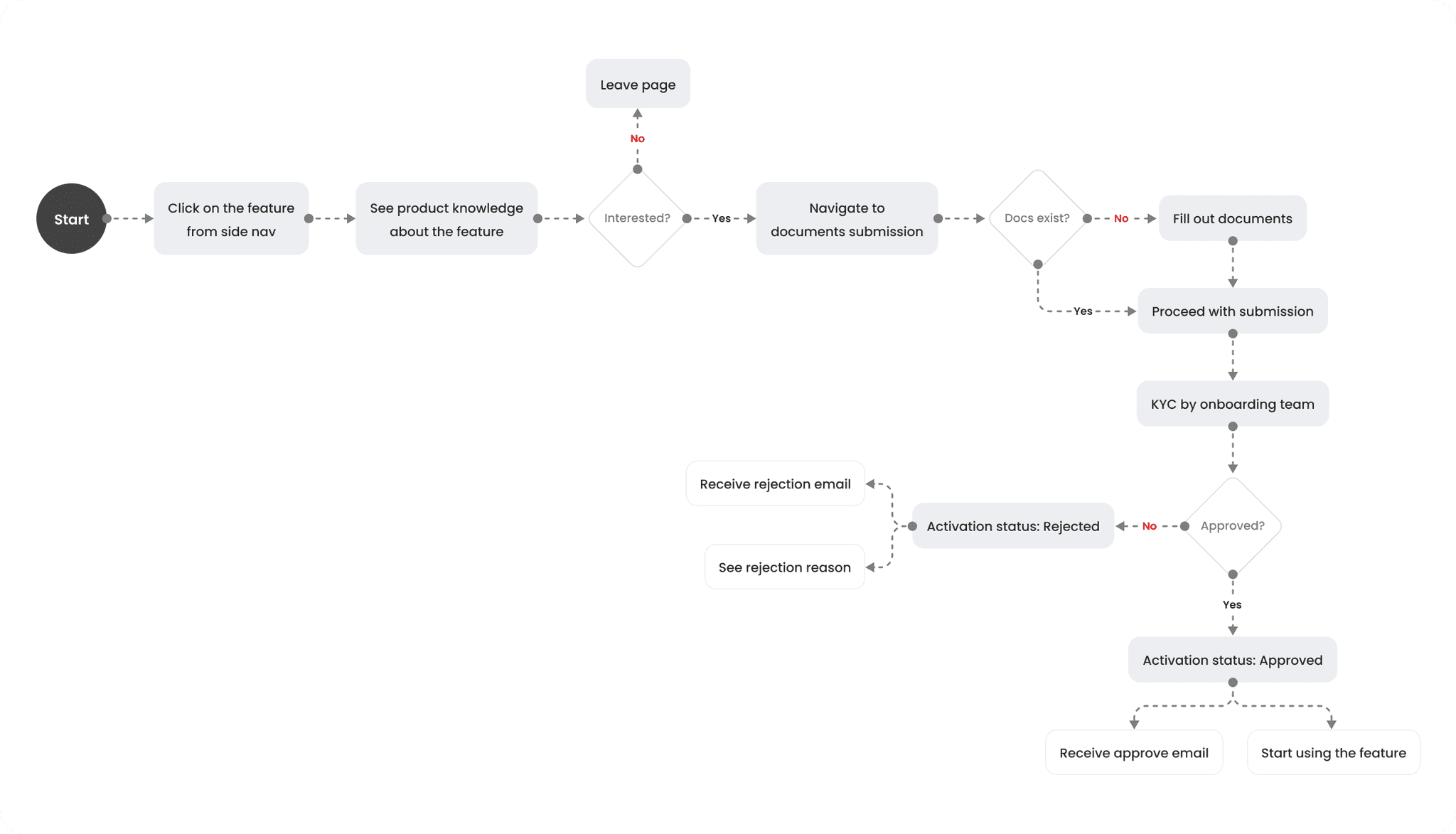
To ensure seamless feature activation flows, any feature that later will utilize this approach, need to consider these 5 important components. It should start with very accessible entry point, provide good understanding about the feature before allowing them to begin the activation process and provide clear expectation on the entire processes.
Accessible
entry point
Feature information
Requirements
submission
Review process
Approval
Wireframing
the idea
As this is the first project assigned to me when I joined the team where I didn't have enough context about the product, I decided to start by exploring the wireframes to quickly understand the intended journey for users and gather more contextual requirements that should be considered for the design.
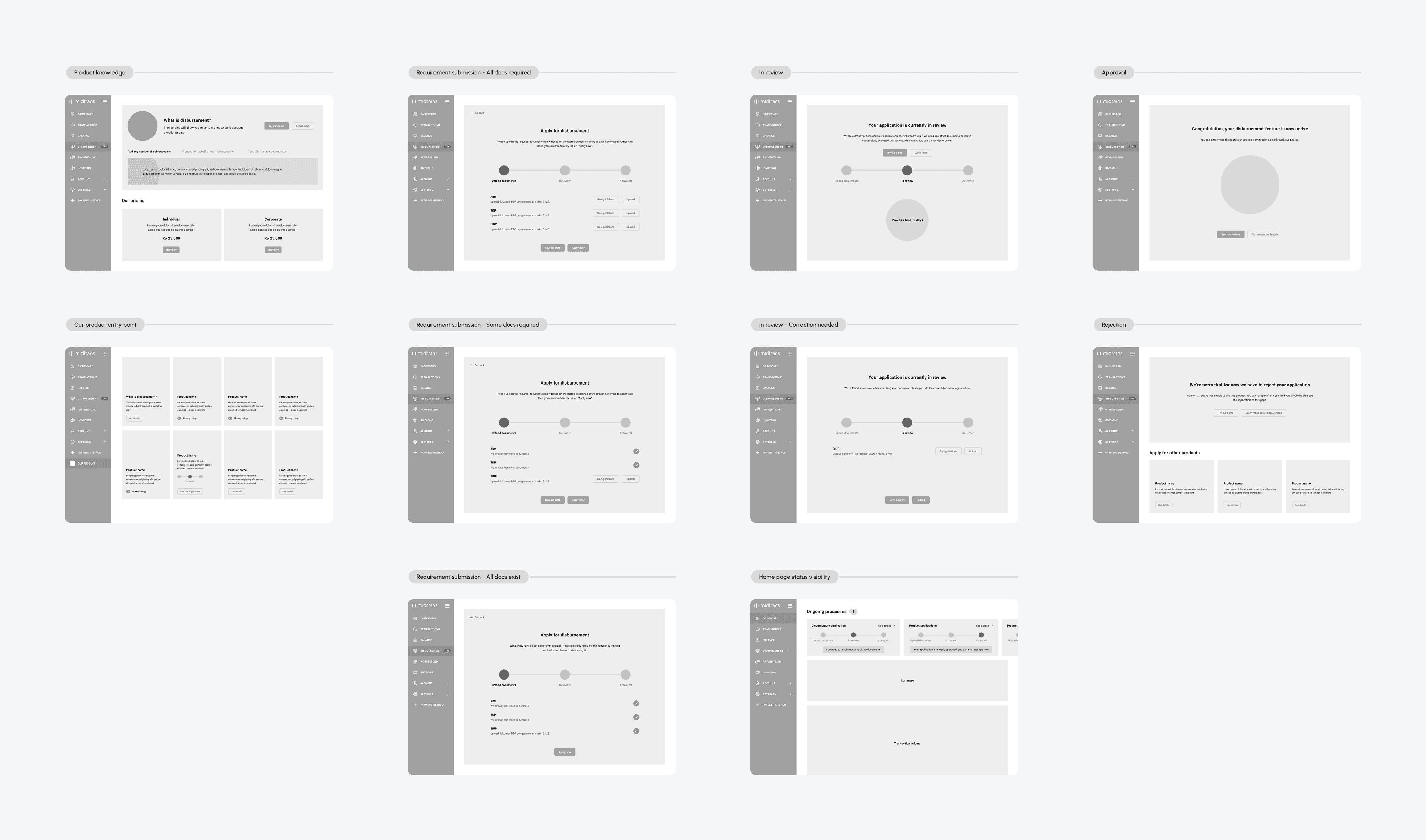
These are the feedbacks that are gathered with the wireframes as I present it to the stakeholders, PM and engineers.
1
There will be no pricing difference between individual and corporate type of merchants. But, there will be multiple pricing scheme which is depending on the method of transferring the money.
2
The information structure and how the layout looks need to have more emphasize on the primary information to catch users attention.
3
To cut down the scope for the first release, we'll only focus on the primary entry point only which is directly from the feature itself. Hence, the "our product" page will be out of scope as secondary entry point for activating the features.
First UI draft
With all the feedback gathered and as it is quite a short journey, instead of iterating the wireframe again. I decided to directly explore the UI design to cut the time & make it more visible for stakeholders to give more thorough feedbacks.
Feature information and knowledge
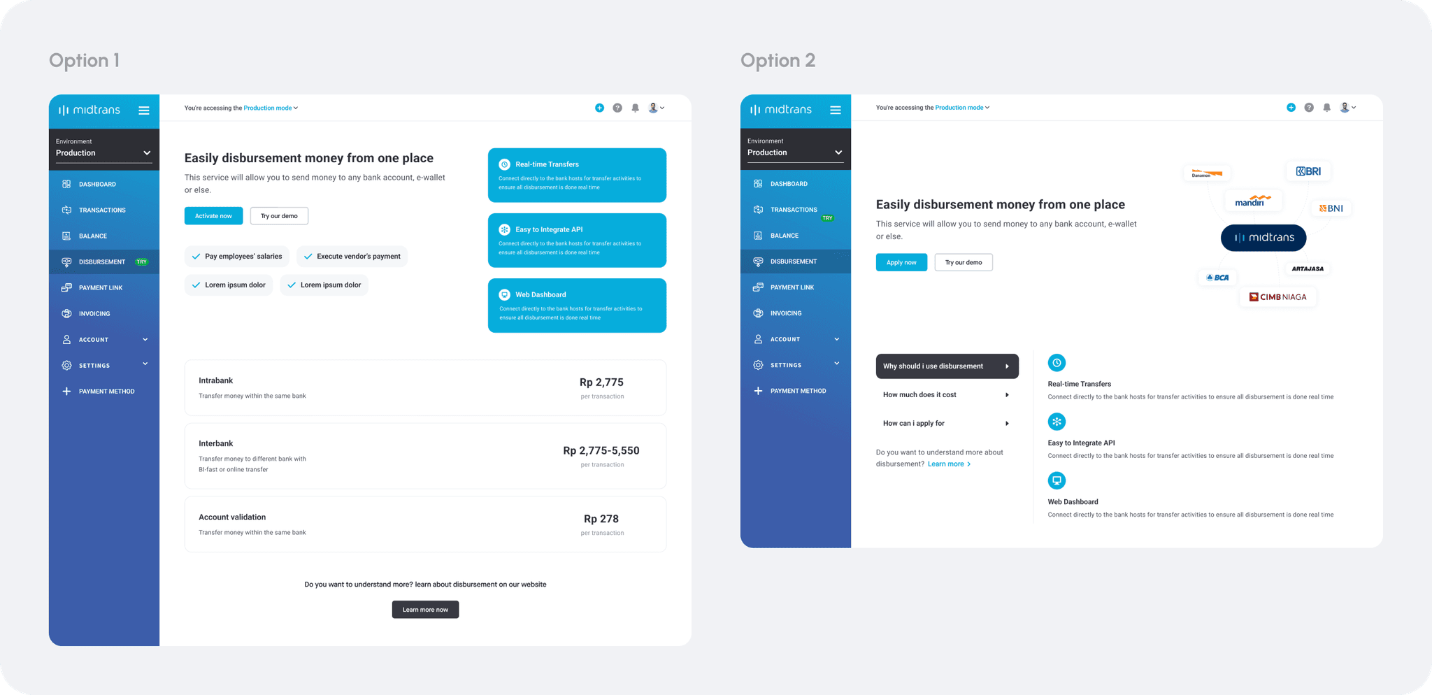
Option 1
The entire page only consist of text which is making it scattered & hard to grasp the information quickly.
Not visually pleasant and more emphasize is needed for the important information.
Need to find better way to attract user with the key information about the feature.
Option 2
Has better information structure that provide easiness to scan the knowledge that users need to know.
But, visually not very pleasant as a page that should attract users attention to user the feature.
With this kind of illustration used, it will be hard to manage it as we might partner up with more banks in the futures.
Document submission and approval process
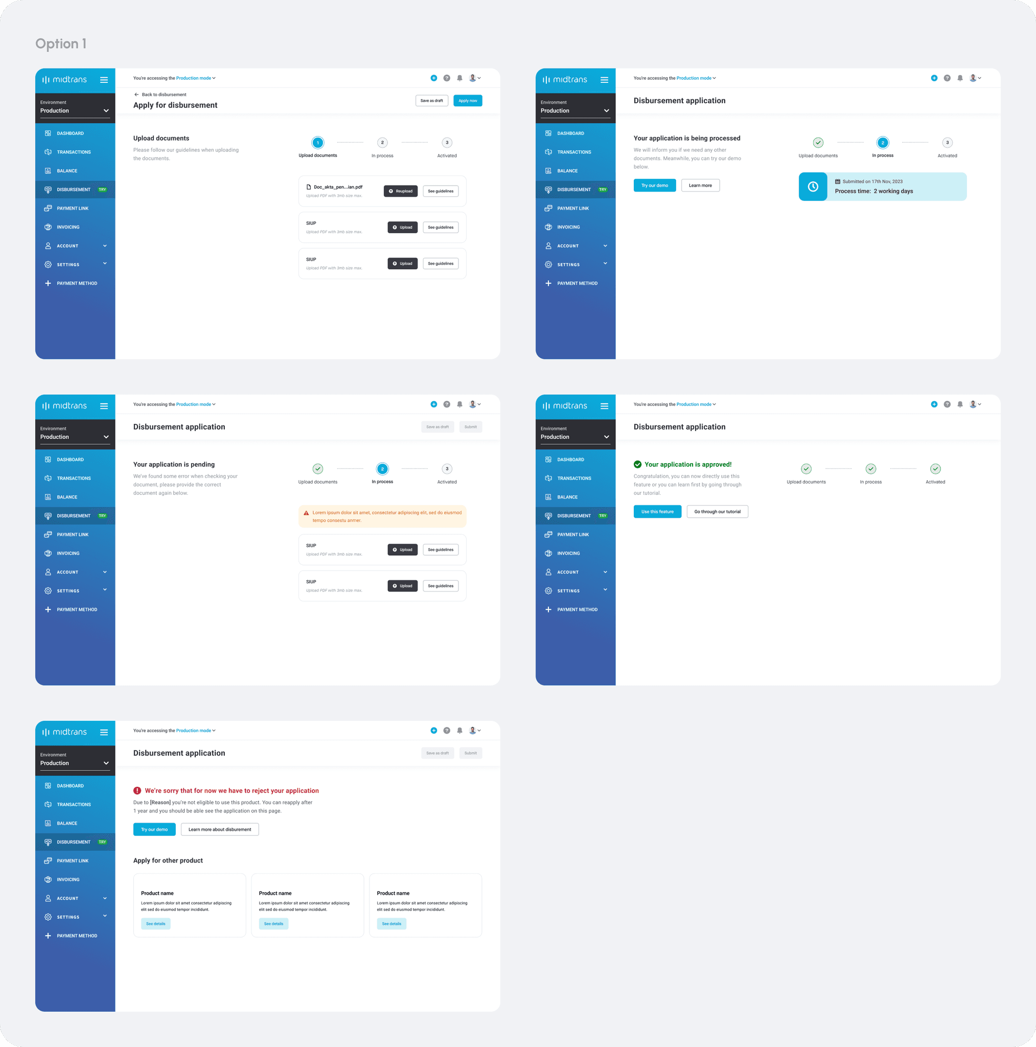

Option 1
The stepper might not be the right component to be used to represent process, as it include both things done by users and Midtrans.
For the documents required, further description of why merchants need to provide it, should be considered to encourage users.
The placement of the primary actions of save draft & submit is too far from the center of activity on uploading documents page.
Option 2
Beside not suitable use case of the stepper component, the placement of it on the top bar seems off with the description below it.
The selection of using card creates the looks of the entire page that is too crowded.
Need a way to automate the saving process without needs of user's manual trigger.
Final UI design
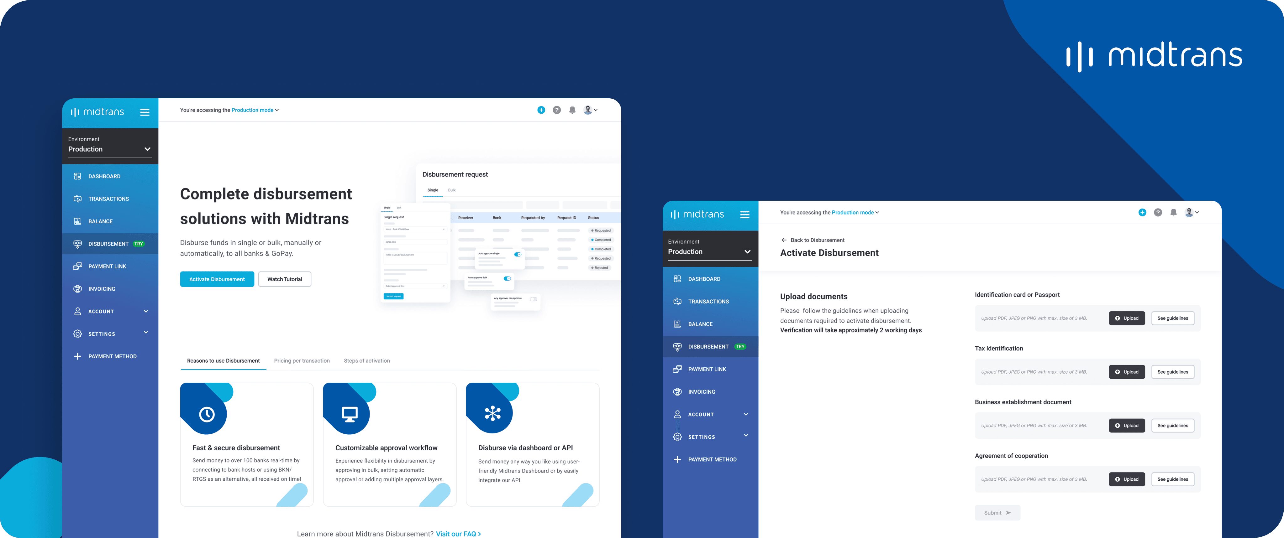
After multiple iterations with back and forth process to gather the feedbacks from PM, manager and engineers. I finally arrived with this final UI of how our merchant can activate the feature easily.
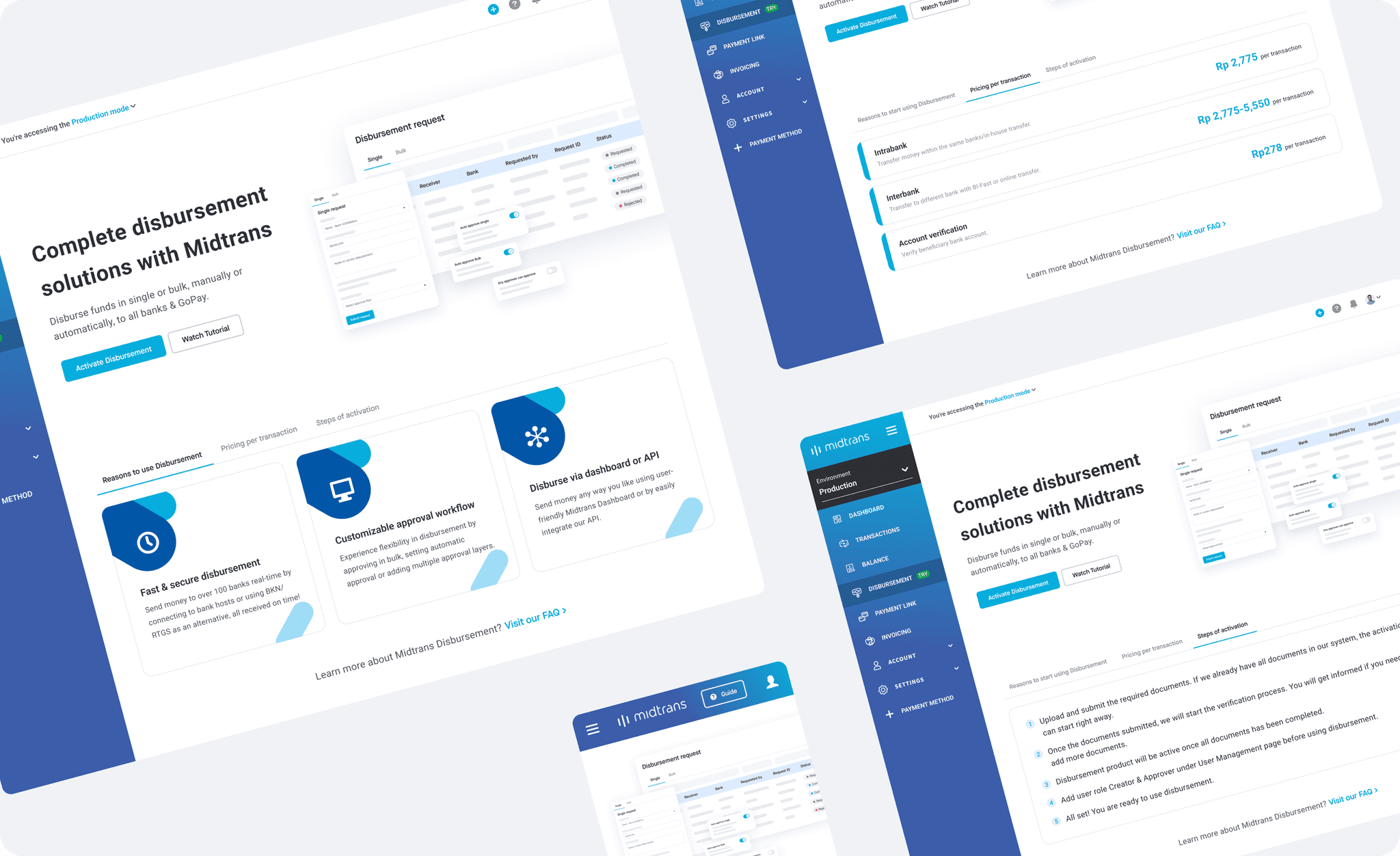
Feature information and knowledge
As I explored the options, I decided to use the slightly altered UI of the actual feature which will better convey about the feature and how it works. A clear headline is chosen to let users briefly understand about what is disbursement feature is exactly. The further informations is structured tidily on the bottom section of the page where users can explore and find out more about why they should use this feature, pricing scheme and steps to activate the feature.
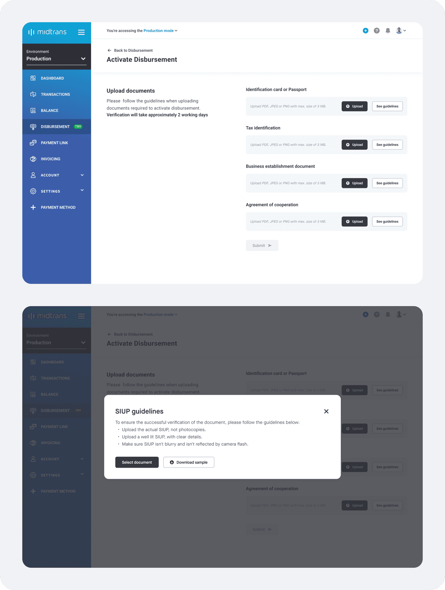
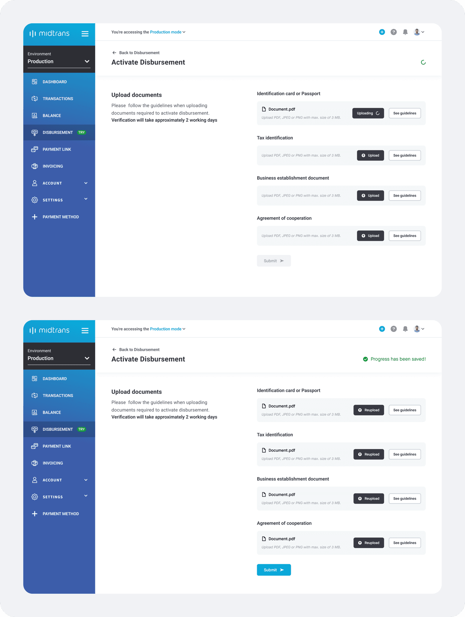
Requirement submission with auto save progress
Since there is only one action needed from users which is to upload and submit the required documents, no stepper or progress indicator needed at this stage. To better communicate the clear expectation of what the process is look like, I utilize clear copywriting in the descriptions with mentioning the approximate process time. With this, I can avoid the uncertainty of users perspectives of seeing too many steps if we use stepper component.
To ensure that user can provide the correct and appropriate documents, clear guidelines along with template that users can download are also provided. As users begin uploading a documents, a greens spinner will appear to indicate that we are saving the progress at the same time and once this upload is completed, a flag indicating the progress has been save will appear automatically. With this mechanism, we'll be able to help users by making sure that they will not miss their progress and able to continue with it at anytime without need to save it manually every time.
Document reviewing process
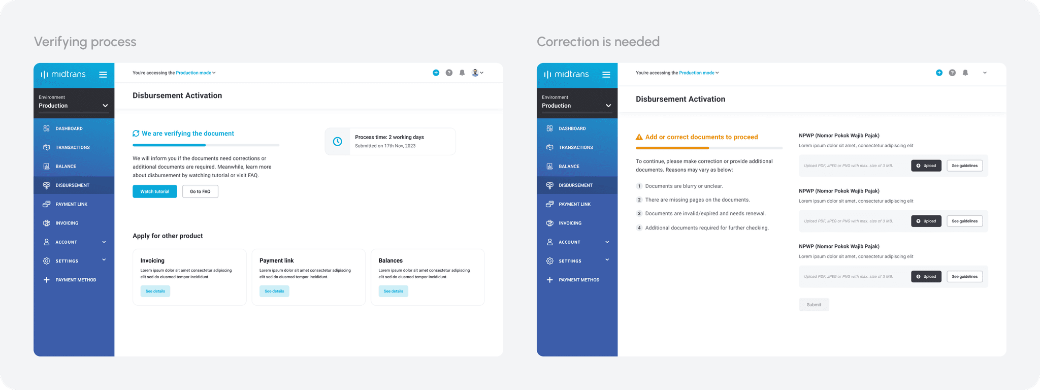
The progress indicator will only appear at this stage to indicate the reviewing process that is currently taking place on our side. Hence, progress bar is chosen as it is more suitable to indicate platform process rather than users action or process. To ensure clear expectation and provide certainty to users, detail process time along with submit date is provided as their reference.
As a result of reviewing process, document corrections or additional documents might be required. But due to technical limitation, we'll not be able to mention what kind of correction is needed for the particular document. Therefore, I can only provide them with 4 general reasons of why document corrections or additional documents is needed.
Wallet activity details
The details page is straightforward that it only contains the information needed for each of activity type. For payout details, the important notes is also shown again to make sure that it can give better understanding to merchants.
UX metrics
Beside using our high level metrics to tell us if we achieve our goals or not, it is also important to set UX specific metrics to let us know why the designs do not achieve the high level metrics at the first place.
Pages or steps
Metrics to track & goals
Product knowledge
Conversion rate of the CTA
To know if merchants are interested to apply for the feature
Documents submission
Conversion rate of the CTA
To know merchants awarness for the required actions
Funnel of clicking CTA to completing the general setting
To know if completing general information is easy enough
General setting completion rate
To know if the entire flow is easy enough to be completed
Funnel of clicking “upload” to “Select document” to documents successfuly uploaded
To know if merchants can perform document upload effectively
Overall completion rate of submitting documents
To know if merchants are able to complete document submission effectively
Abandone rate
to know if merchant need more time before uploading a file
Upload rate
To know how long it take until merchant can upload the file
Download sample rate
To know how many have downloaded the sample, hence understand it correctly
Resubmission rate
To know if merchants are not able to upload document correctly
Documents in review
Submission rate for resubmission case
To know if merchants are able to do resubmission effectively
Correct resubmission rate
To know if merchants are able to correct the documents that required resubmission
Approval
Click thru rate of add role CTA
To understand if merchant attempted to complete the action
Add role completion rate
To know if merchants are able to perform the required action effectively
Impact delivered
Unfortunately, this project is not released yet as previously it was already in implementation stage, however due to swift in our priority of Q1 2024. The development of this improvement is currently set on hold and will be revive as there is enough bandwidth from the engineering team.
