Redesigning Midtrans's
home page legacy
2024
Website
At Midtrans, we’re committed to consistently delivering value to our users through empowering them to manage their businesses more efficiently. To support this mission, the design team initiated a project to reimagine the dashboard experience. The goal: to deeply understand our merchants' evolving needs and create a more intuitive, user-centric homepage that streamlines users' daily operations & enhances overall productivity.

Who are the users?
Midtrans users range from individual entrepreneurs to large enterprises, many of whom manage multiple merchants under a single account.

What is my role?
As the product designer, I took full ownership of the project—from initial discovery through to the final concept—leading both the research and design phases, ensuring a cohesive and user-driven outcome.

What are the goals?
To enhance the merchant experience and empower them to be more productive by improving the functionality and usability of Midtrans’s dashboard.

What we are solving?
The current Midtrans homepage lacks useful functionality and does not effectively support merchants in managing their business operations.
Start with why
Initial problem statement
Since its initial release in 2012, the Midtrans dashboard has never been revisited or redesigned. Over time, we've consistently received feedback that merchants rarely use it—instead, many opt to build their own dashboards that better serve their business needs.
Design processes
Throughout the project, I carried out a series of structured processes to ensure I could accurately define the core problems and address them effectively with the right design solutions.

Discovery
Analyze current design & the market
Facilitate internal workshops

Define & validation
Set success metrics
Define high-level design approach
Create & validate hypotheses

Design exploration
Translate idea into sitemap
Explored & iterated wireframes
Understanding
the current situation
When I was first assigned to this project, I had limited knowledge about the product and its users since I had just recently joined the team. This naturally brought a lot of uncertainty about how to approach the work. To get started, I spent time understanding the product by reviewing the current designs and identifying the key challenges we were facing before moving on to explore possible design directions.
The current dashboard design
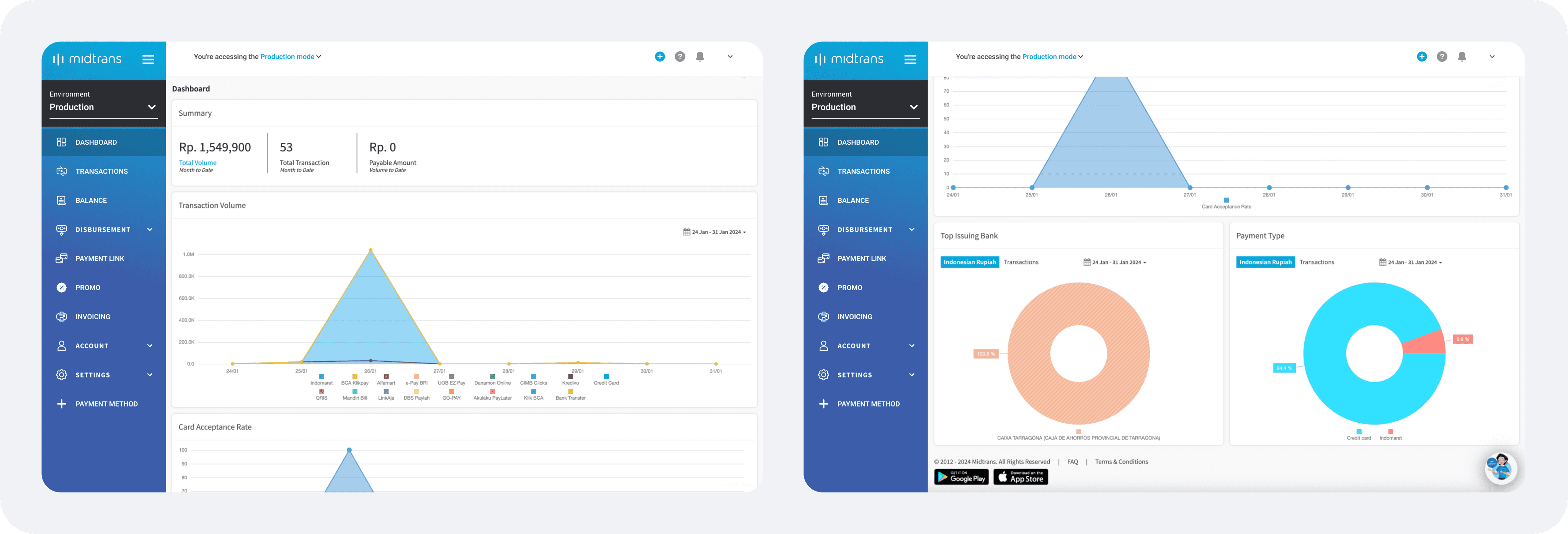
The current dashboard page only serves to give merchants a quick overview of their performance, displaying five main categories of information, which are:
Summary of transactions & balance
Transaction volume per payment method
Card acceptance rate
Top issuing bank
Payment type distribution
Current challenges we are facing
Feedback indicates low usage of the Midtrans dashboard. This could suggest one of two things: either users don't need a dashboard, or the current version doesn't provide enough value. After speaking with our sales and support teams, they also shared that:
1
The dashboard page doesn't provide relevant data or insights tailored to the different roles of our users.
2
The information presented isn’t actionable, leaving merchants unsure of what steps to take after viewing it.
3
It lacks shortcuts for frequent actions, making common tasks more time-consuming for merchants.
4
It doesn’t help merchants identify urgent information or improve its discoverability.
5
There are no educational resources provided to help merchants understand and utilize the data effectively.
What's in the current market
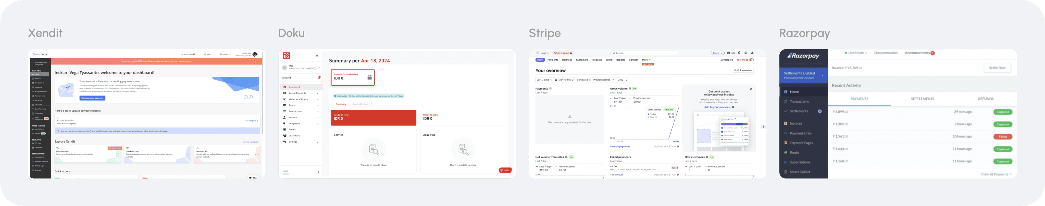
Understanding what similar products in the market offer is essential—not to reinvent the wheel, but to identify proven patterns that can be scaled and tailored to meet our merchants' specific needs.
1
Most of them offer clear guidance on how to act on the data shown and utilize it more effectively.
2
Quick actions are included to streamline workflows, allowing faster completion of frequent tasks.
3
Enabling users to explore the functionality of tools and features futher.
4
highlight new capabilities or features to keep users informed and encourage adoption.
5
Enabling users to compare data over time, helping them better understand performance trends.
6
Offering customizable dashboards to accommodate different user roles and needs
7
Clear indicators & improved discoverability to items that need immediate attention.
8
Real-time data aggregation, making it immediately relevant and actionable for business decisions.
The foundation
With a solid understanding of the product and current market landscape, it became essential to establish a foundational direction and working hypotheses. These would serve as guiding principles to inform and shape the improvements.
General UX principle of a good dashboard

Our hypothesis of how to improve our dashboard

Provide a relevant summary of merchants’ sales, performance, and the services they are using

Help users reduce the time needed to complete tasks within the platform

Summarize Midtrans’ capabilities and highlight key information users need to know

Cater to the needs of all user types and roles through inclusive design and approach

Improve dashboard usability and functionality to encourage consistent usage

Enable users to learn how to effectively utilize the information presented
Reassessing
the needs
Since there was no foundational research available to indicate our merchants' needs regarding the dashboard, I began this initiative by reassessing those needs through a short internal workshop. Given the limited research bandwidth at the time, this approach allowed us to gather initial insights without directly involving our users.
Running internal workshop, redefining the problems & JTBDs
During the workshop, I involved multiple internal teams including product managers, engineers, sales, support, and business. Together, we mapped out the key jobs to be done for our users, identified current pain points, and generated potential solutions. This collaborative process provided valuable insights into user needs and existing challenges, forming a strong foundation for the next stages. I then organized all insights into FigJam to streamline analysis, spot patterns, and start shaping early solution ideas based on the challenges we uncovered.
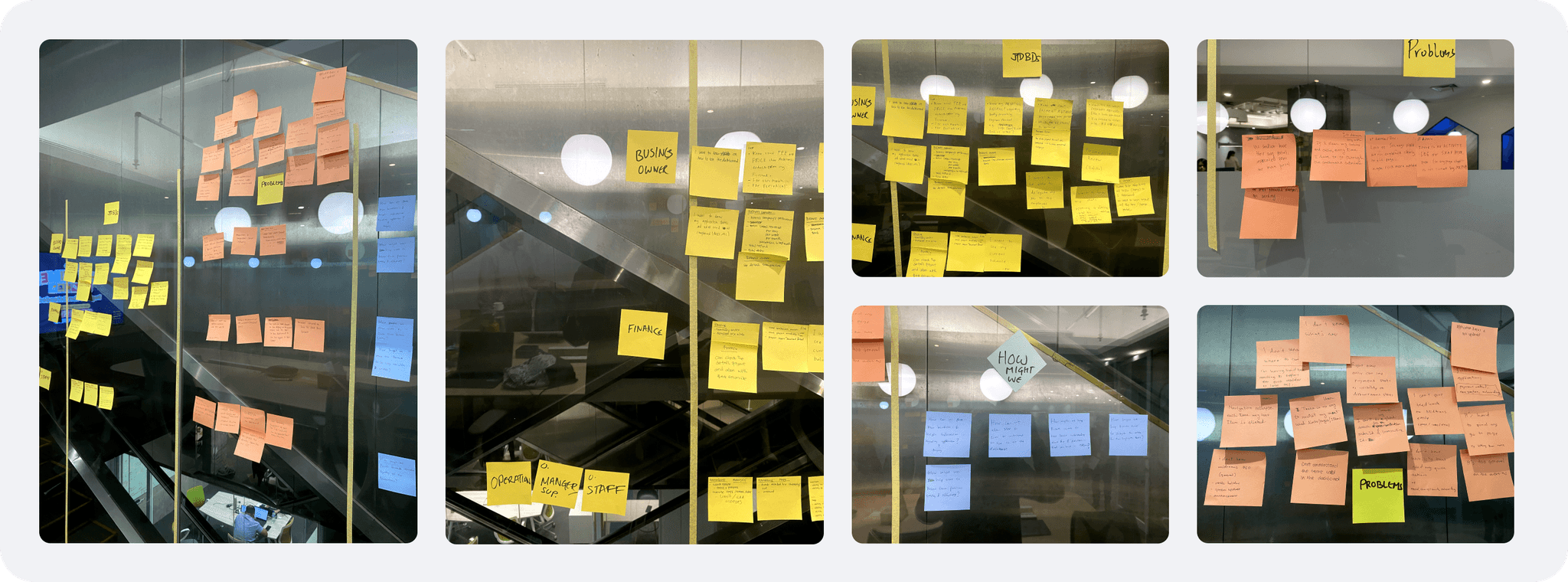
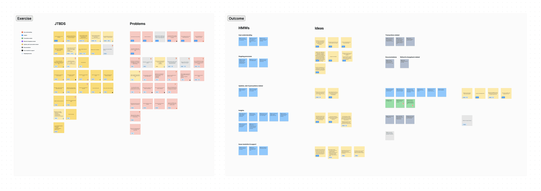
Current problem discovered
Users don't know how to use anything
No way to revisit the most used function, page or actions
Hard to reach support for resolving their issues
Some terminologies used is hard to understand
Less intuitive UI to guide users to use it
Not real time data, making it not immediately relevant
It doesn't help merchants do their tasks quickly
No other visibility of the current occurrence or status
No information of the updated capabilities or feature
Low discoverability of items that required actions
Role and their jobs to be done
Finance
Reviewing, managing & approving transactions.
Executing payout to customer or supplier.
Executing payroll.
Generating reports
Creating & managing invoices.
Marketing
Creating & managing promo.
Reviewing running promos performance.
Generating reports.
IT admin or developer
Setting up services to be used by merchants.
Testing out the transactions.
Checking the API configuration.
Customer service
Reviewing transaction.
Facilitating refunds of the transaction.
Troubleshooting issues and raising support tickets.
Measuring
our success
Before defining new approaches for the dashboard page, I established clear success metrics to guide the design direction. These metrics ensure that proposed solutions are aligned with the identified problems and provide a benchmark to measure the effectiveness of the redesigned experience.4o

Improve merchants' productivity in running their business
Empower merchants by providing insightful, relevant, and actionable data that supports faster and more informed decision-making in their daily operations

Reduce time taken to complete the task
Enhance the discoverability of critical items and provide intuitive shortcuts or entry points to complete tasks

Improve merchant awareness of current events and capabilities
Provide clear, timely information about key updates, ongoing activities, and newly available features

Improve merchant problem resolution
Make it easier for merchants to report issues or get help, ensuring faster support & minimize disruptions to their business.
Addressing
the problems
With a clear understanding of the current situation, key problems, and desired outcomes, I began addressing the challenge. I started by brainstorming potential solutions, then developed these ideas into actionable hypotheses that could be tested and validated.
Brainstorming the high level approach
This brainstorming session was conducted with my manager, who helped refine my understanding of both the product and its core challenges. Together, we identified four key focus areas to guide our high-level approach for improving the dashboard experience:
1
Increase visibility of ongoing processes
2
Enhance awareness of critical information, current events, and items that require immediate attention
3
Present more relevant and actionable insights
4
Provide shortcuts and guided actions, streamlining user tasks
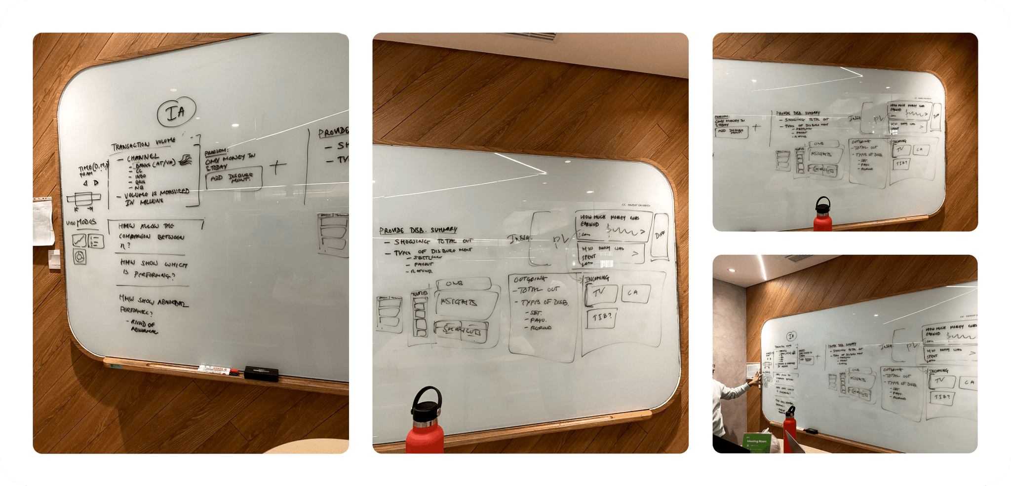
Proposing the new information architecture
To shape the new dashboard structure, I collaborated closely with the product manager to gather insights on what merchants truly need. By combining these perspectives with an analysis of the current information architecture, I developed a proposed structure tailored to better serve our users. At this stage, we agreed to focus not on specific user roles, but rather on merchants’ needs as a whole—laying the groundwork for validation.
Validating our hypothesis
At that stage, the proposed structure was still a hypothesis, and I wasn’t entirely certain if it reflected what merchants truly needed. Ideally, I wanted to validate it directly with our users—but due to limited resources, I couldn’t involve merchants at the time.
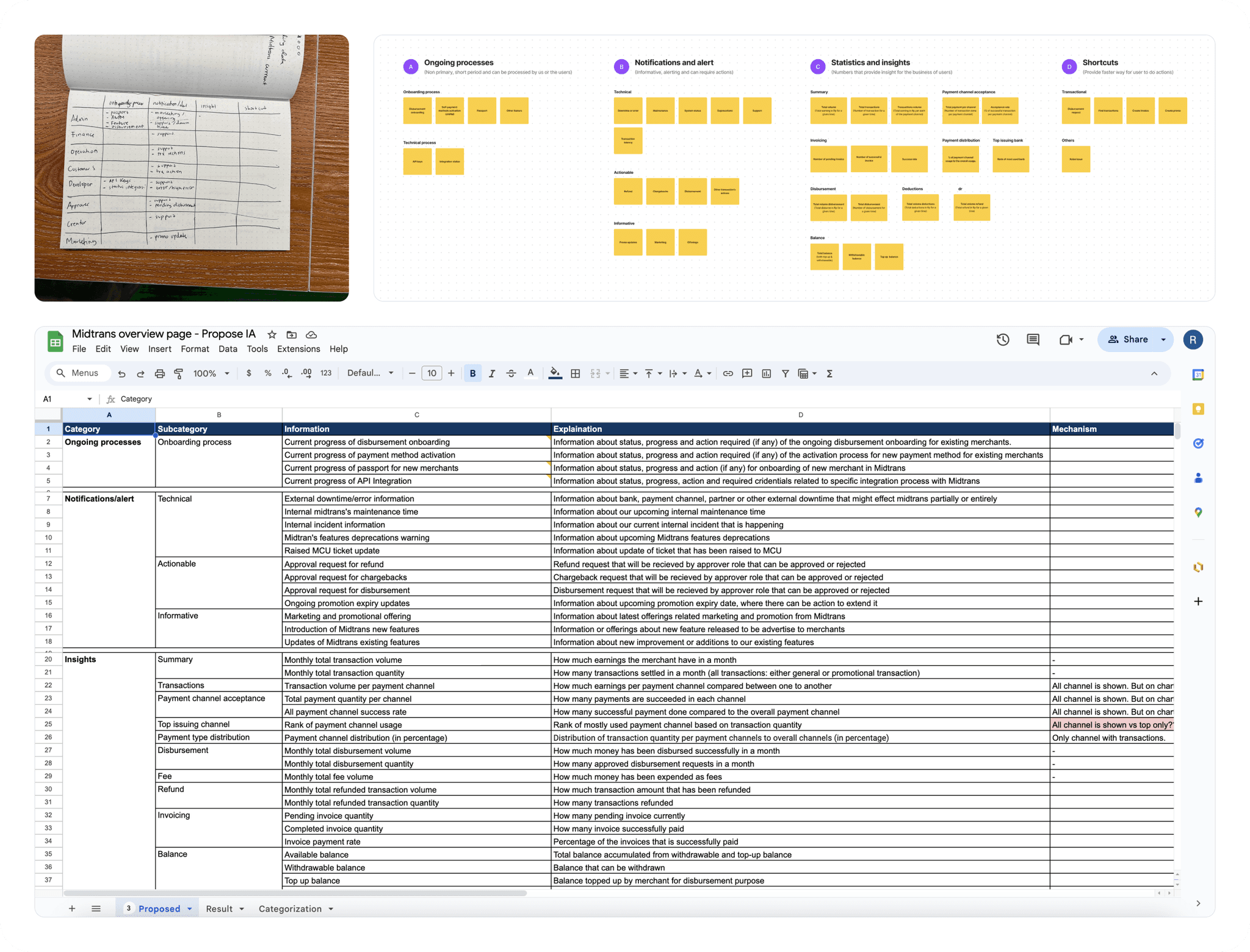
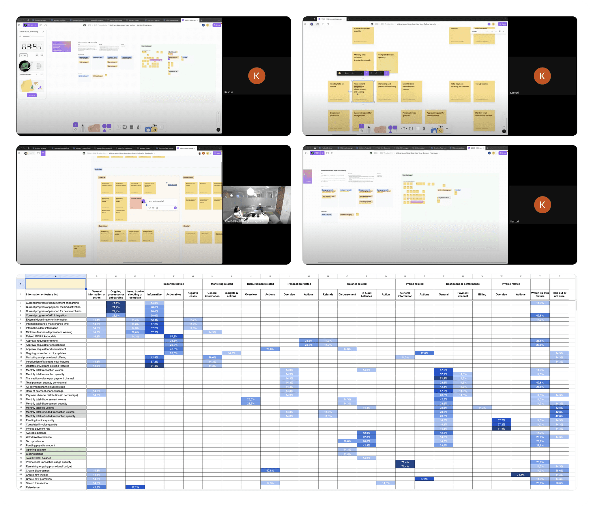
To address this, I turned to our internal teams who work closely with merchants—specifically the sales and support teams. I planned and conducted multiple open card sorting sessions with seven team members. This method was ideal, as it helped uncover merchants’ mental models through proxy, and allowed me to validate the proposed dashboard structure.
After completing the sessions, I analyzed and visualized the results in Excel to identify trends. Encouragingly, the overall structure aligned well with my initial hypothesis. However, I discovered two distinct patterns in how participants grouped quick actions—some preferred a centralized entry point, while others grouped them alongside related information. This insight helped refine the structure further.
Wireframe concept
After validating my hypothesis, I gained confidence in the proposed approach to address the identified problems. Using these insights, I moved forward to translate the ideas into a more tangible and actionable concept.
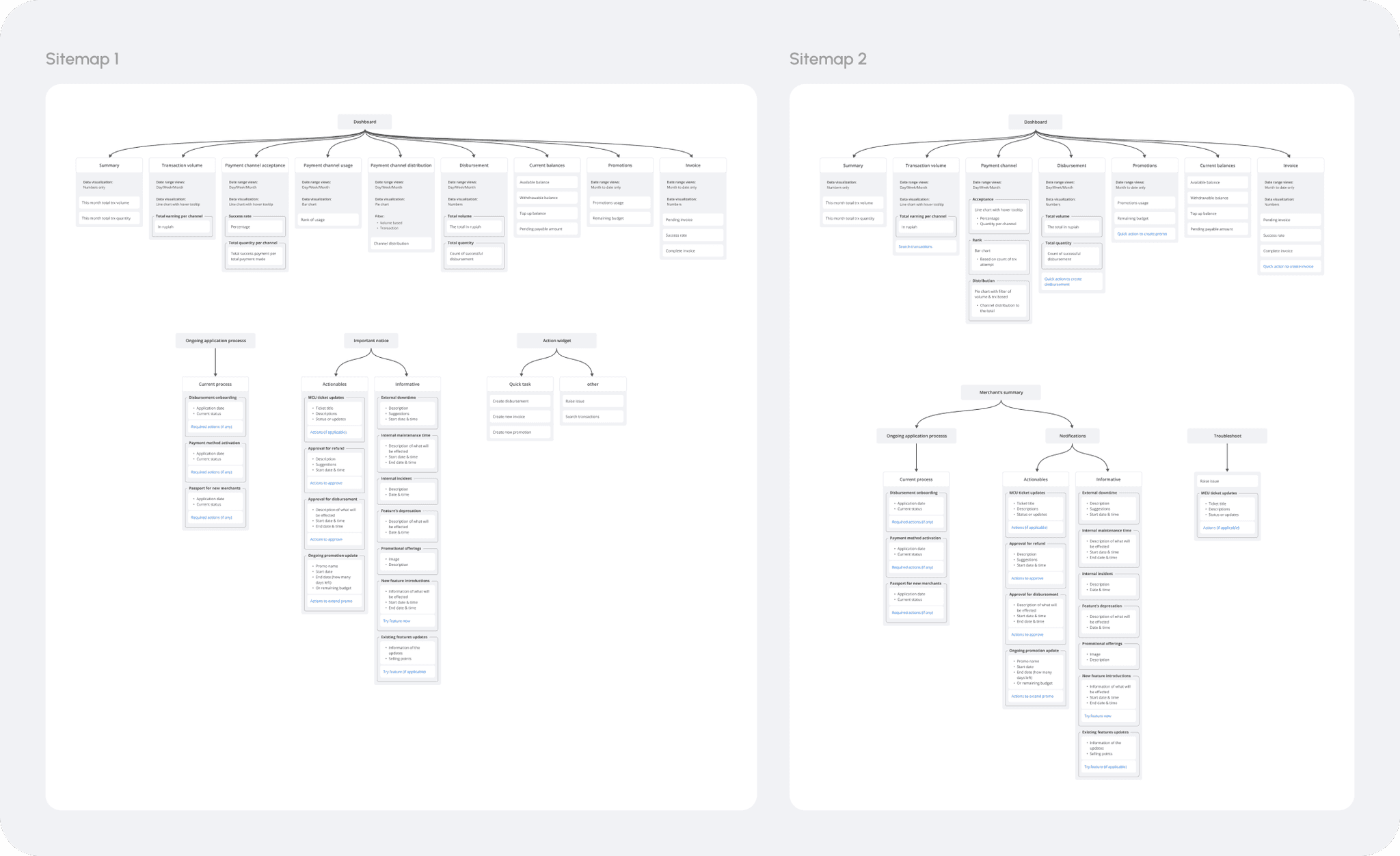
Translating the finding into sitemap
Based on the card sorting results, I translated the findings into two sitemap variations to guide wireframe exploration. Both versions grouped performance and summary data under “Insights.” In the first sitemap, information was divided into three distinct sections: ongoing processes, important notices, and quick actions. In the second version, ongoing processes and important notices were combined under a “Merchant Summary,” quick actions were embedded within their relevant insights, and troubleshooting was treated as a standalone section.
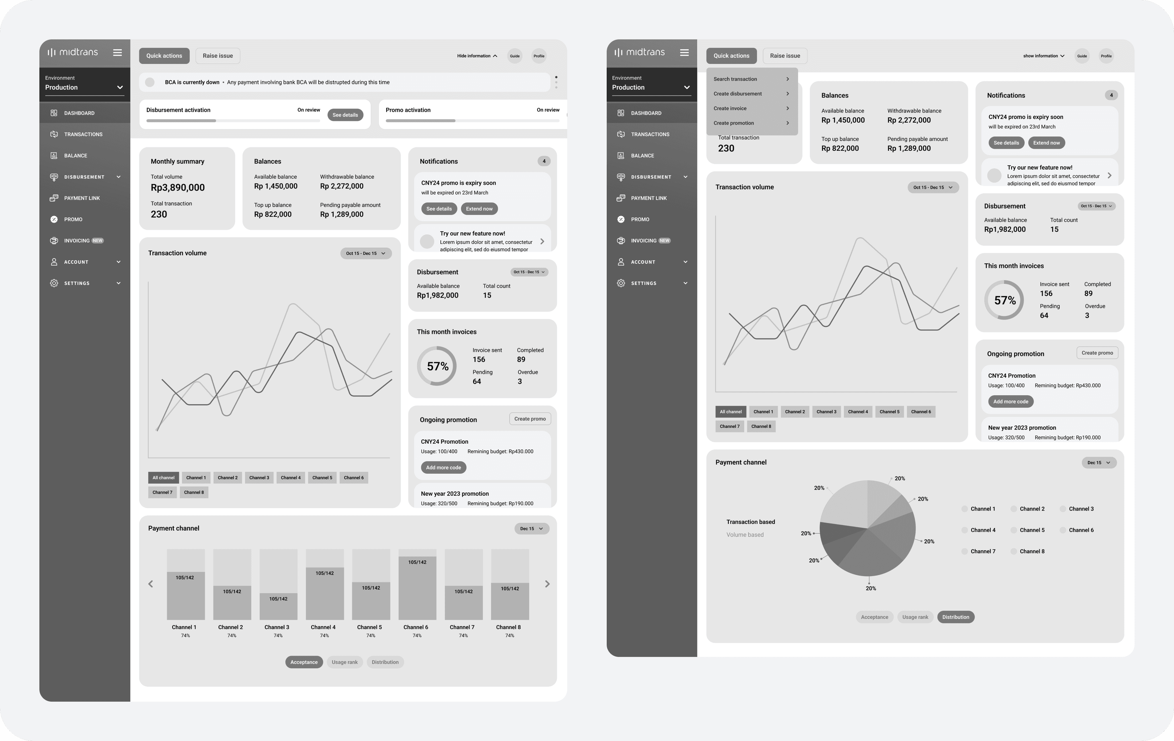
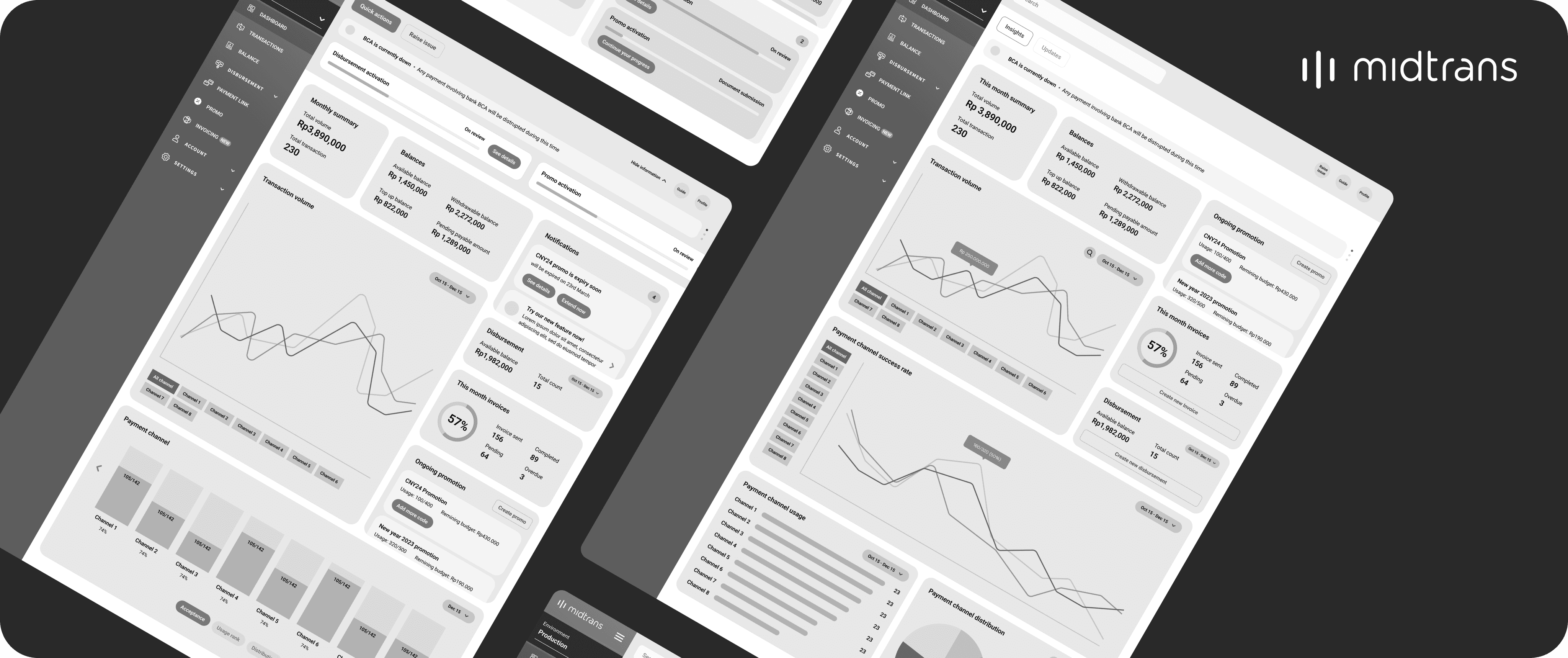
Dashboard wireframe concept 1
In this wireframe, I translated the sitemap into a single, comprehensive dashboard page where merchants can access all key information in one place. The core function of this page is to provide actionable business insights—such as sales, transactions, and balances. A new notification widget is introduced to deliver ongoing updates like system information, promotions, or required actions. Less frequent but critical updates, like ongoing processes or system status, are placed in the top bar to maintain visibility. The top bar also hosts a centralized quick action menu and a shortcut to raise issues, ensuring these essential tools are always accessible throughout the Midtrans platform to streamline merchant workflows.
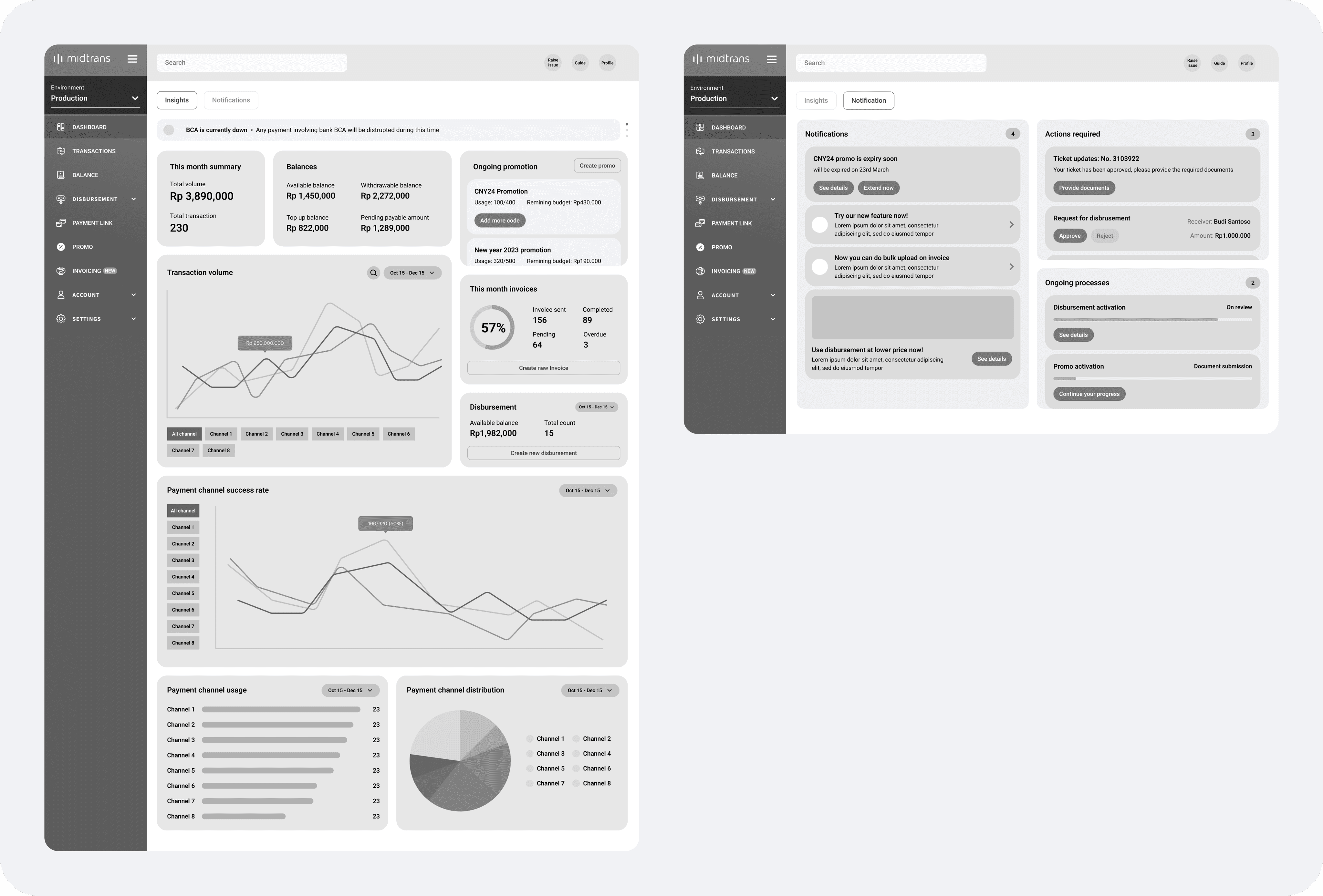
Dashboard wireframe concept 2
The main concept of this wireframe is to split the dashboard into two focused pages—one for business insights and another for updates such as notifications, alerts, ongoing processes, and required actions. This separation allows users to better absorb information by reducing clutter. Quick actions are made more contextual by placing them within their relevant widgets, such as the disbursement action inside the disbursement widget. To boost awareness of current occurrences and reduce uncertainty about system reliability, important updates are positioned at the top of the insights page, making them easily visible each time merchants log in.
What's next?
Unfortunately, this project had to be put on hold due to a shift in priorities for Q1 2024. However, it was planned to resume the initiative in Q3 2024. When the project continues, the next step will be to validate the proposed wireframes through concept testing directly with our merchants.