Redesigning Midtrans's
home page legacy
2024
Website
Midtrans as a product always wants to ensure that we can always provide benefit to our users, including making them to be more productive in running their business. To be able to achieve that, as a design team we want to initiate our own initiative to redesign our current dashboard or home page. Therefore, this project is all about redefining our merchants needs and designing the new experience of our home page.

Who are the users?
Midtrans users are varied from individual to enterprise businesses who might manage more than 1 merchant under them.

What is my role?
As the product designer, I took the entire ownership and responsibility of this project to run it from initial discovery state to the final concept, which includes research and design phase.

What are the goals?
To enhance merchants experience and enabling them to be more productive by providing better functionality of Midtrans's dashboard or home page.

What we are solving?
The current function of Midtrans's home page that is not useful enough to be used by our merchant for helping them with running their business.
Start with why
Initial problem statement
Our dashboard or home page in Midtrans since the first release back in 2012, never get revisited to be redesign at all. At the same time we keep getting feedback that no one is using it, and merchants tend to build their own dashboard that will be more beneficial for them.
High level objectives
To provide better dashboard page of Midtrans that is not only usable by our merchant, but should be beneficial for them to improve their productivity, hence business.
Design processes
A series of processes are done through out the length of the project to ensure that i am able to define the right problems and address it effectively with the proposed approaches.

Discovery
Analyzing the current design & market
Conducting internal workshop

Define & validation
Setting up success measure
Defining high level approach
Hypothesis creation & validation

Design exploration
Translating into sitemap
Exploring the wireframes
Understanding
the current situation
When I first assigned for these project, I don't really have much knowledge about the product & users since I've just recently moved to the team. This definitely created a lot of uncertainty for me of how I can approach this. To begin with, I took the time to really understand the product by look at the current designs and deep dive more on the main challenges that we might have before exploring the possibility of the design.
The current dashboard design
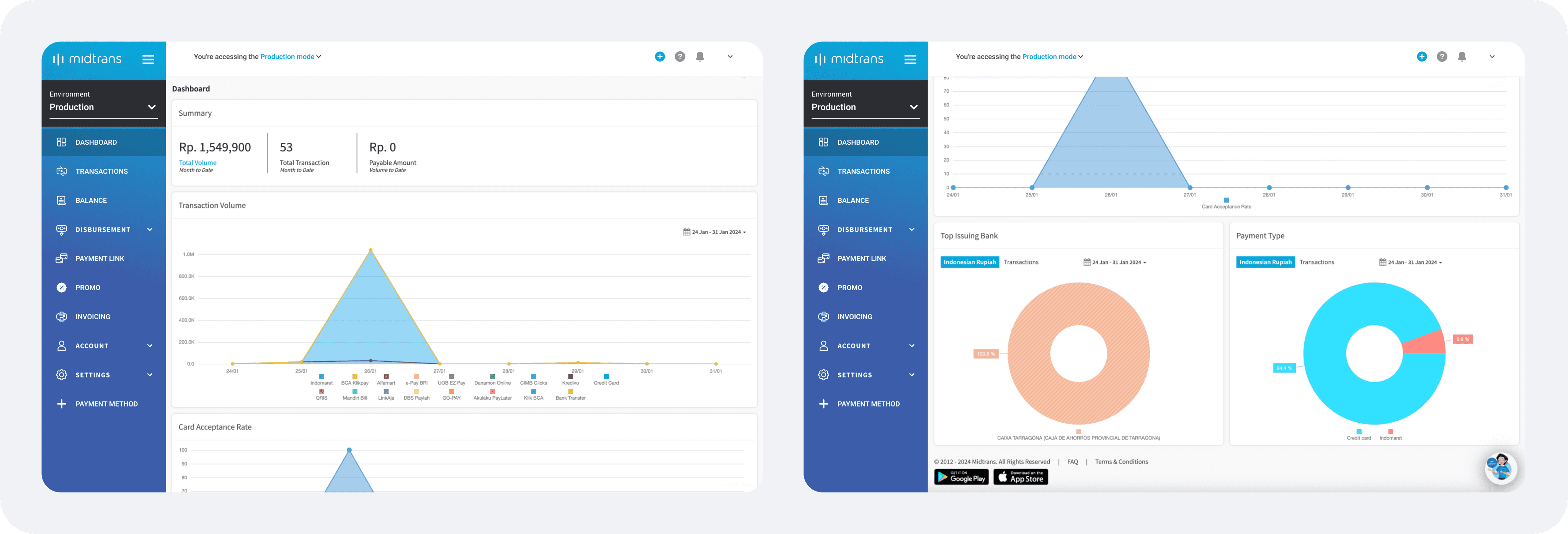
The current dashboard page only serve the function to give merchants quick insight about their performance by providing 5 category of information which are:
Summary of transactions & balance
Transaction volume per payment method
Card acceptance rate
Top issuing bank
Payment type distribution
The current challenges we are facing
Based on the feedbacks that we often received, there is actually low usage of Midtran's dashboard. However, this might means 2 things that either users don't need dashboard at all or our dashboard is not useful for them. As i talk to our sale & support team, they also conveyed that:
1
The dashboard page doesn't provide relevant data or insights to all different roles.
2
Information is not directly actionable for our merchants, meaning they don't know what to do after seeing that.
3
It doesn't provide shortcut for doing frequent actions or making the journey shorter.
4
It doesn't help merchants to discover urgent information or at least increase it discoverability
5
No educational resource or learning that we provide to merchant for enabling them to utilize the data.
What's in the current market

It's also important to understand what the current market of the same products are currently providing, so I don't have to reinvent the wheel again. By understanding it I can scale it to cater our merchant's needs.
1
Most of them provide guidance of what actions to take or how to utilize the provided data.
2
Quick actions provided to reduce time taken for users in doing their task
3
Enabling users to explore the functionality of tools and features.
4
Provide awareness for new capabilities or features on their platform.
5
Allowing for comparison to better grasp user’s performance insights from time to time.
6
Offers customizable capabilities to cater needs for all type of users.
7
Clear indicator & discoverability for items that needs attention.
8
Aggregating the data in real time, making it immediately relevant for business actions.
The foundation
As the understanding about the products & current markets have been gathered, it is important to established general foundation & hypothesis that should be used as a base and guidelines for improving our dashboard.
General UX principle of a good dashboard

Our hypothesis of how to improve our dashboard

Provide relevant summary of merchants sales & performance, as well as the services they are using.

Enabling users to reduce the time taken to complete their tasks within the platform.

It should summarize our capabilities & all the things users should know to ensure that it is usable.

The design & approach should cater the needs for all type of users, as well as roles.

It should ensure users to use the dashboard by improving it's usability & functionality.

Enabling users to learn of how the can utilize the information provided effectively.
Reassessing
the needs
Since previously there is no foundational research that can indicates the needs of our merchants towards our dashboard. As I started the initiative, I aimed to reassessing the needs first by doing short internal workshop, as we are also limited with research bandwidth at the time that limiting us for directly involving our actual users.
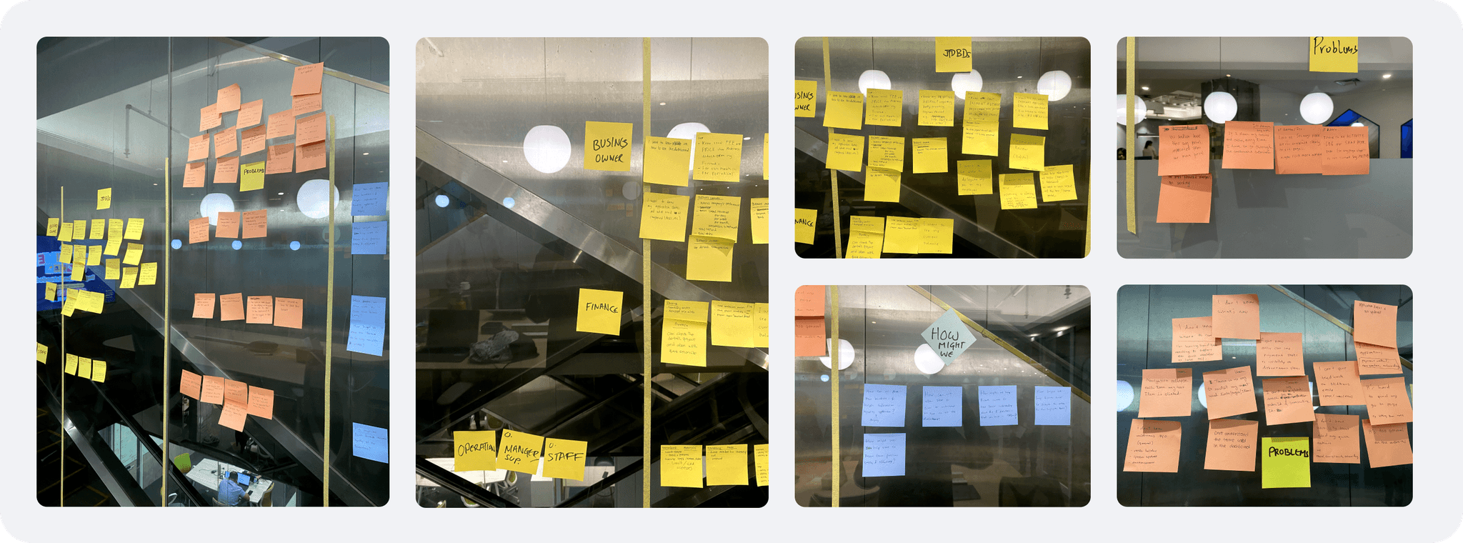
Running internal workshop
To ensure that i can get wider perspective on this short workshop, i involved multiple internal teams from PM, engineer, sales, support and business. During the workshop we defined what kind of jobs to be done for our users, the current problems that they're facing, as well as generated ideas of how we might possibly solve them. This really helpful from to further understand the needs and current problems that occurs.
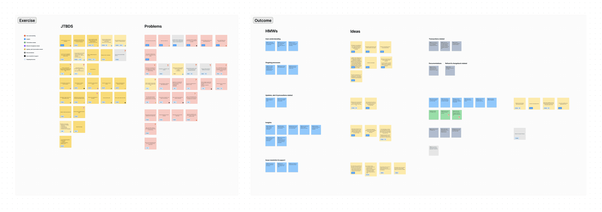
Redefining the problems & JTBDs
To easily analyzing the insight that we have generated, I transferred it all into Figjam to easily group and assess them one by one. This process has also allowed me to come up with rough ideas to solve the problems that are defined from the workshop.
Current problem discovered
Users don't know how to use anything
No way to revisit the most used function, page or actions
Hard to reach support for resolving their issues
Some terminologies used is hard to understand
Less intuitive UI to guide users to use it
Not real time data, making it not immediately relevant
It doesn't help merchant do their action quickly
No other visibility of the current occurrence or status
No information of the updated capabilities or feature
Low discoverability of items that required actions
Role and their jobs to be done
Finance
Reviewing, managing & approving transactions.
Executing payout to customer or supplier.
Executing payroll.
Generating reports
Creating & managing invoices.
Marketing
Creating & managing promo.
Reviewing running promos performance.
Generating reports.
IT admin or developer
Setting up services to be used by merchants.
Testing out the transactions.
Checking the API configuration.
Customer service
Reviewing transaction.
Facilitating refunds of the transaction.
Troubleshooting issues and raising support tickets.
Measuring
our success
Before moving forward with defining the new approaches for our dashboard page, success metrics should be set to allow me to know the directions to achieve as the current situation and problems have been discovered.

Improve merchant's productivity in running their business
Providing them with insightful and useful data that immediately relevant and actionable for their business

Reduce time taken to complete the task
Improving discoverability of items that need attention & enabling users to shorten their journeys

Improve merchant's awareness on current occurrence and capabilities
Providing certainty for users on the current situation, as well as new capabilities that they might have

Improve merchant's problem resolution
Allowing merchants to easily raise their issues to let us solve their problems immediately
Addressing
the problems
With good understanding of the current situation, problems and things that we want to achieve. I felt that It was the right time for me to begin addressing the problem. So, i started by brainstorming to then develop the ideas and transform it into hypothesis that I can validate.
Brainstorming the high level approach
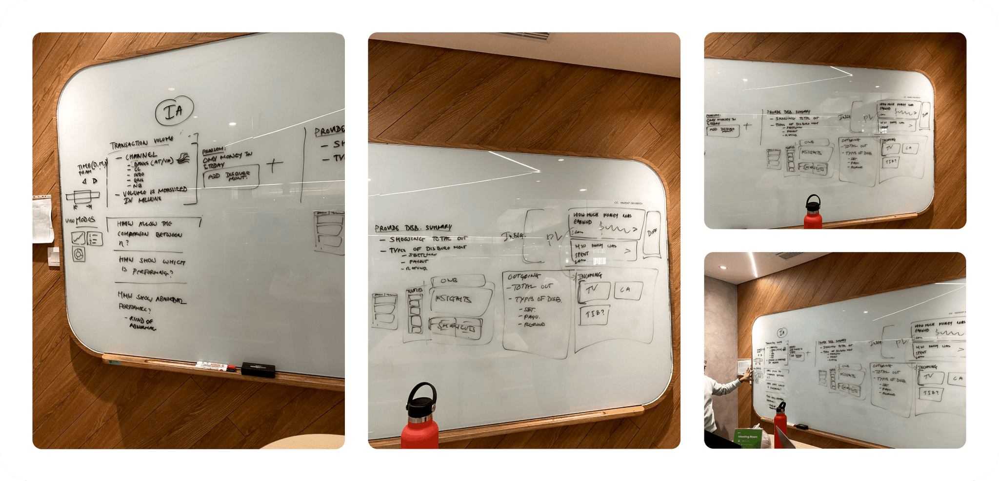
This brainstorming session is done together with my manager who helped me with sharpening the understanding of the problems and the products itself. Through this process we were trying to define the key area that we should focus and how we can approach it in high level. These are the 4 key area that we should focus for improving our dashboard:
1
Improve visibility of ongoing processes
2
Better awareness of needed informations, current occurrences and items need attentions
3
More useful and relevant data for merchant's insights
4
Shortcuts to shorten users journey on doing their task.
Proposing the new information architecture
With the help of the product manager, I gathered more understanding of their perspective on what merchants might need. Along with analyzing the current information architecture, I was about to come up with my proposed structure for our new dashboard page. At this point, we are agreed to not focus on role's specific, but instead think about merchants needs in general and how we can validate it.
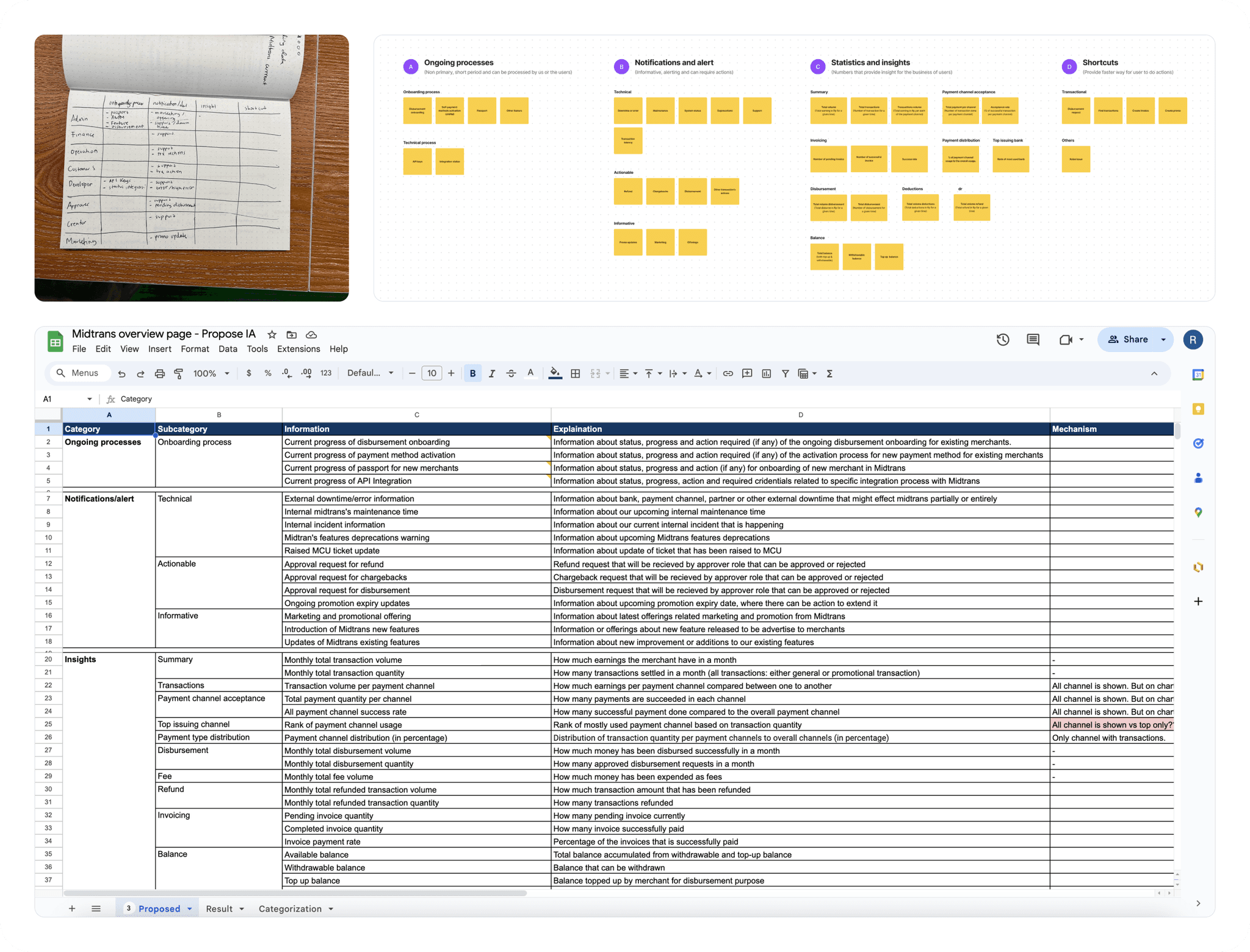
Validating our hypothesis
At that time, it is purely hypothesis & i'm not entirely sure if this is exactly what merchants needs, therefore I want to be able to validate and learn from the merchants. However, due to limited resources again, I couldn't directly involve merchants. Hence, I decided to validate it with our internal teams that are close the merchants and probably can represent them which are the sales and support team.
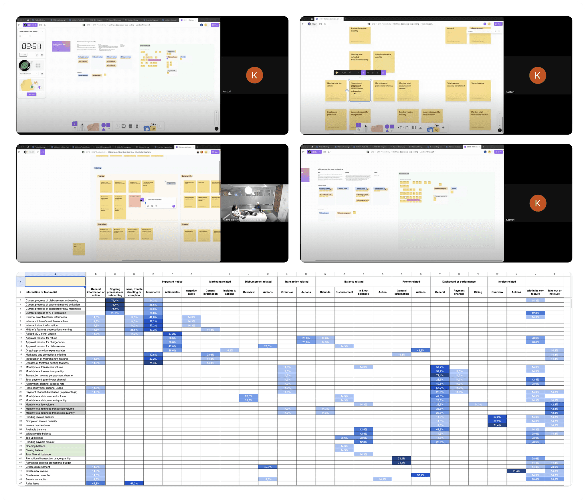
So, I planned and conducted multiple open card sorting sessions with 7 internal teams. This research method is very suitable for this purpose as it helped me understand the metal model of merchants towards our dashboard page, as well as allowed me to validate my hypothesis of the new dashboard structure. After completing all the sessions, I analyzed the result and plotted it into excel to give me the visualization of how they tend to structure the information.
I found out that generally the result is align with my hypothesis. However, there are 2 significant tendencies for grouping the quick actions. Some of them grouped it together as a single quick actions entry point and the other grouped it together with its related information.
Wireframe concept
As I have validated my hypothesis, I've become more confident with my proposed approach to address the problems. I then use this result to proceed forward to transform the ideas into more tangible concept.
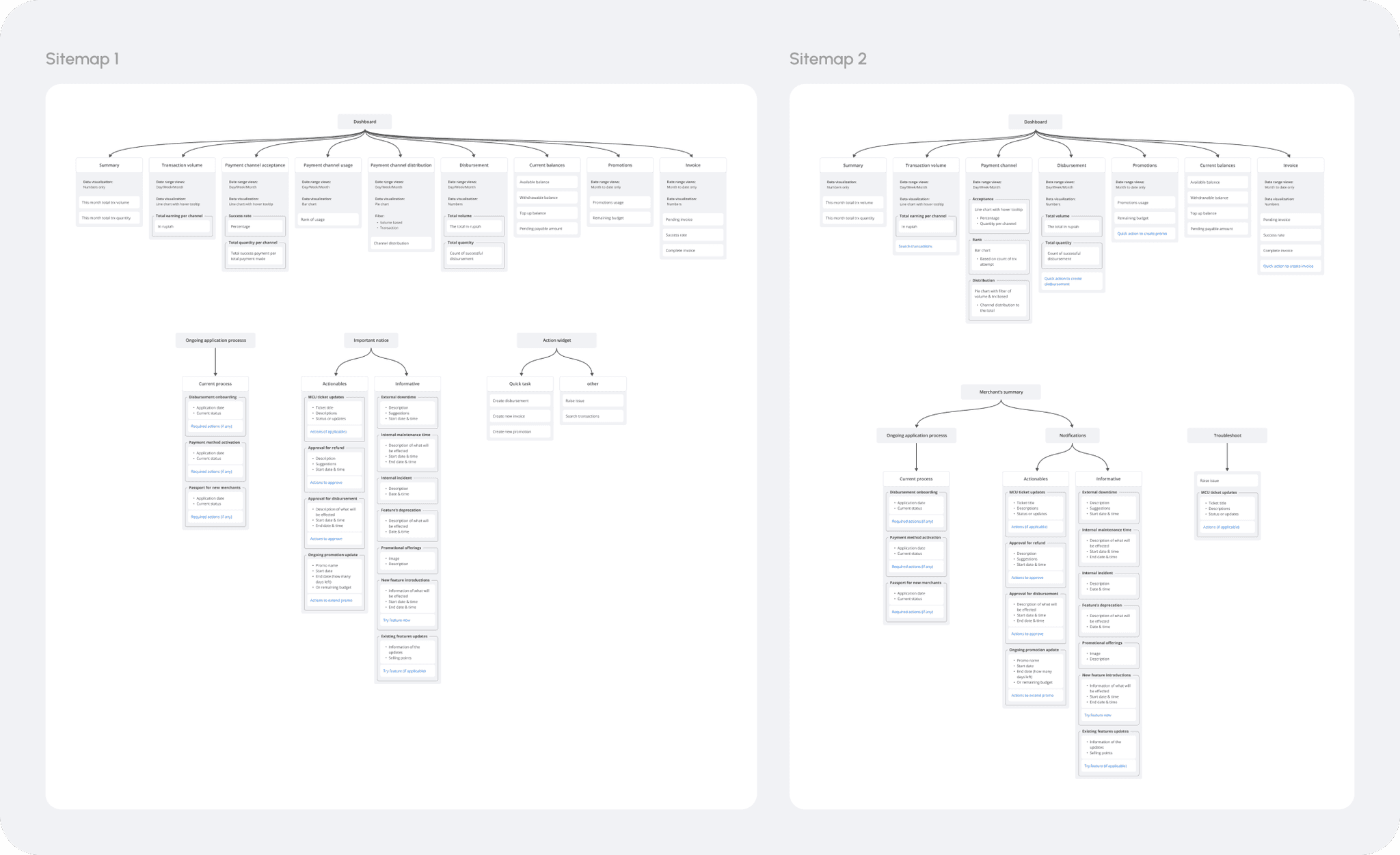
Translating the finding into sitemap
With the result of my card sorting, I translated it into sitemaps which let me easier to explore the wireframes on the next step. In general, both of them are similar that the data of performance and summary are grouped under insight. However, on the first sitemap further separate is done to 3 different categories of information which are ongoing processes, important notice and quick actions widget. While on the second sitemap, ongoing processes and important notice is grouped under merchant summary and quick actions are put under their own related information within insights separately, with troubleshooting as a stand along function.
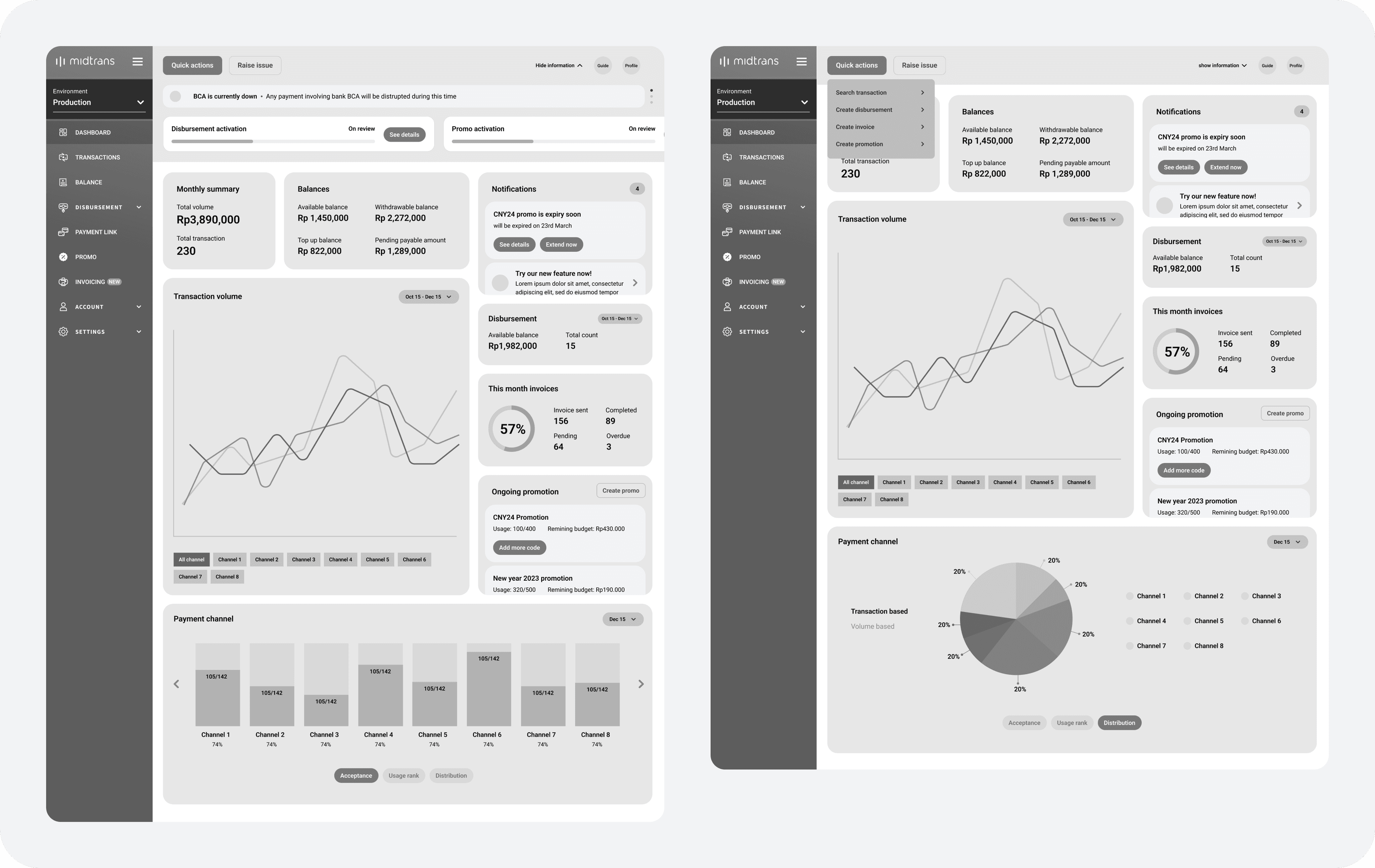
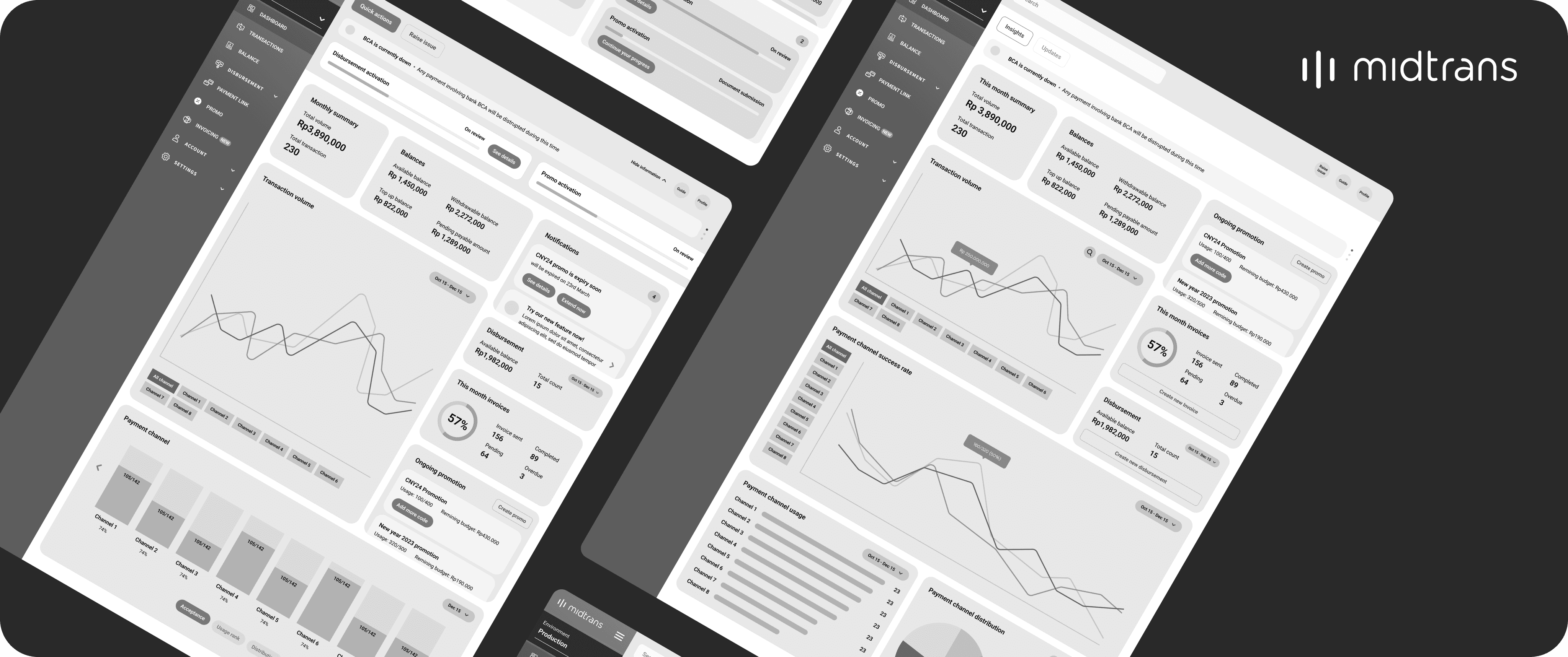
Dashboard wireframe concept 1
On this wireframe, I interpreted the sitemap into a single page of dashboard where merchants can see and access all the information from within this page. The main function of the page become the source of insight about their business's performance such as sales, transactions, balances etc. New notification widget will be introduces also to contain regular informational news, marketing promotion, updates and things that required actions from merchants.
The information that will only appear occasionally such as current occurrence or system status, and ongoing processes are put within the top bar to ensure that it is always visible for users in order for them to not miss it. Lastly, a dedicated place to access all quick action is places on the top bar together with the capabilities to raise issue immediately, with this I can ensure that both of the function will always be accessible from all places within Midtrans to shorten their steps.
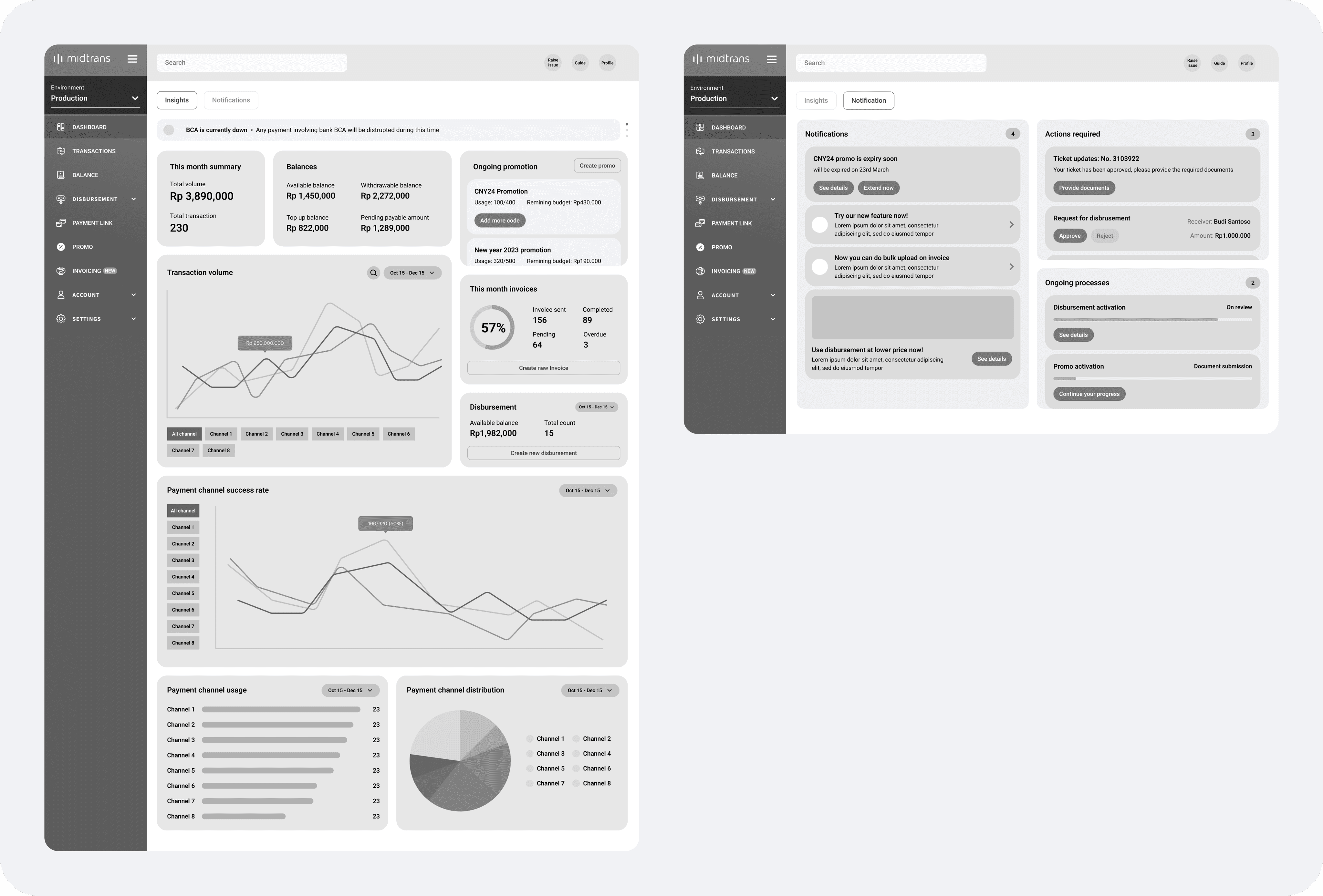
Dashboard wireframe concept 2
The main concept of this wireframe is that dashboard's function will be separated into 2 main pages which are for seeing their current business performances as insights and for seeing their updates in form of notifications, alert, ongoing processes and things that require actions. With this kind of approach, it will create more focus on each of the page which will let users easily digest the informations.
Aside from that, the quick actions are made more contextual as it is placed within its related widget, for example action to create disbursement is placed within disbursement widget itself. And lastly to increase merchant's awareness of current occurrences, the information is place on the top of the insight page to let user easily see this every time as they login or land on dashboard page. With this i aiming to be able to eliminate the uncertainty towards our system reliability.
What's next?
Unfortunately, this project must be put on hold due to immediate swift in our priority of Q1 2024 and we are planning to continue the effort by Q3 2024. By the time we pick this project again, we should be continuing by validating the proposed wireframe by using concept testing directly to our merchants.
