About the project
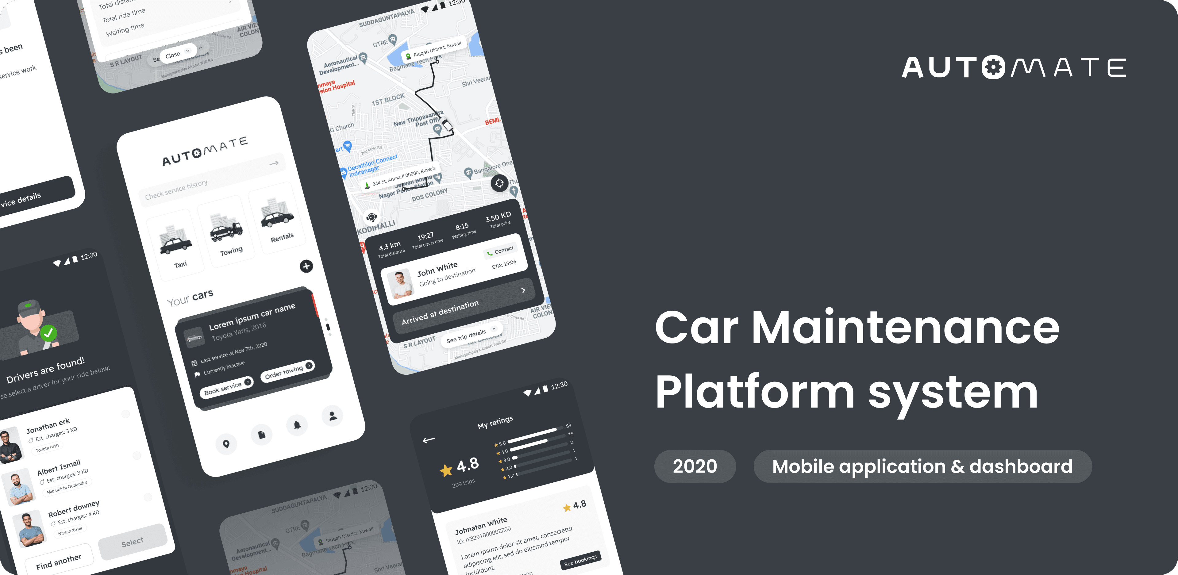
Automate was a mobile application that exists in Kuwait, that provides the users with end to end experience to do maintenance to their cars. Beside that, they will have additional secondary services which are to allow users to get on demand taxi and towing service.
This project is mainly about rebuilding that existing app and provide end to end cars maintenance system of multiple users and devices to provide seamless experience between customers, drivers and merchants. Hence, there will be wider range of user types who will be using these mobile apps and dashboards.
What is my role?
I was responsible for redesigning the whole platforms needed to support the car maintenance system from scratch, staring with defining the flows, information architecture to finally creating the final UI. However, some graphical assets were derived from some open sources.
What are the goals?
To give best experience for users to do car maintenance, from getting reminder on car’s maintenance, booking for services & workshop appointment, getting help in delivering the car, to finally getting the cars delivered back to them.
Who far is the scope?
Redesigning multiple UX/UI of main customer app, 2 driver apps, 4 merchant’s web dashboards and 1 main super admin’s web dashboard.
What we are solving?
To build and connect between multiple users (customers, drivers and merchants) on top of predefined and current system, to give the best user experience as possible.
The My design processes

Understanding the conditions & objectives
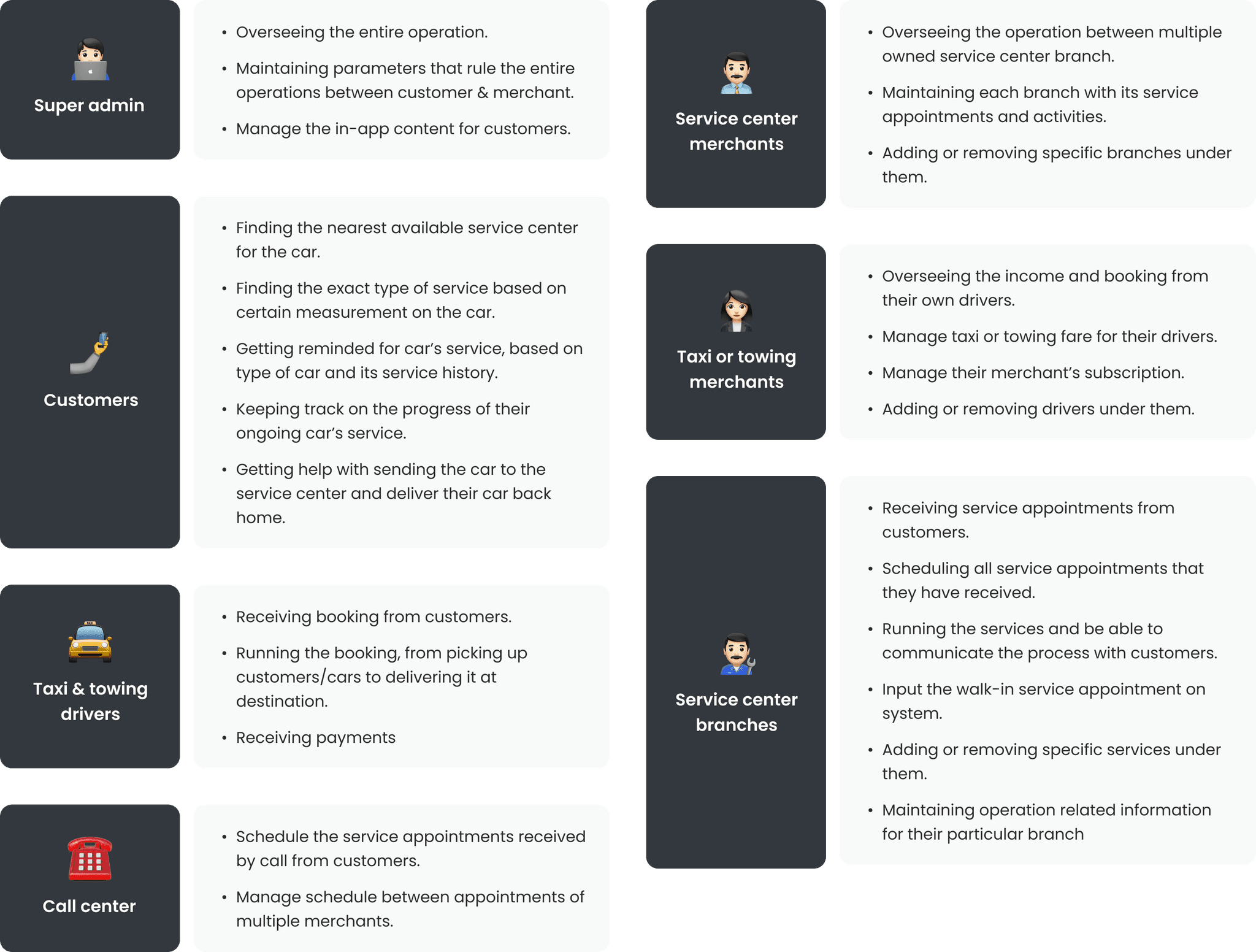
To begin with i started by going through SRS documents that my client has provided which contain their plan on operational flows, users, current existing app, their objective and the predefined system to build the UX on top of that. From there, i listed down and summarized the different user roles they will have, together with their tasks to be done.
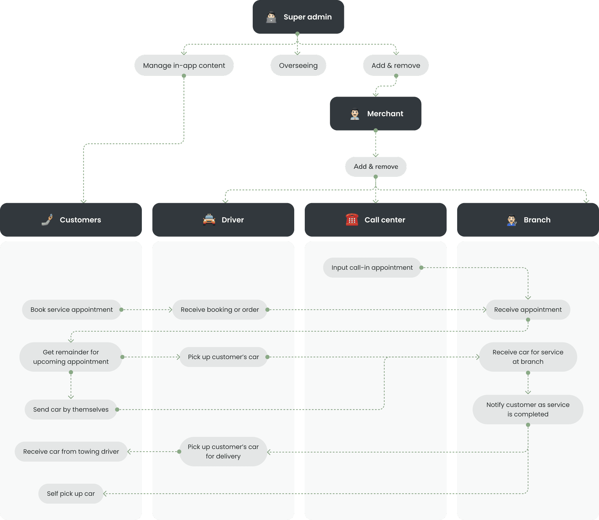
To be able to understand their business model on car maintenance, i created my version of business flow describing the baseline of how each user's role will interact with each other. I then brought this up to my client for confirmation and getting a green light to proceed with this flow.
Emphathizing the users & their problems
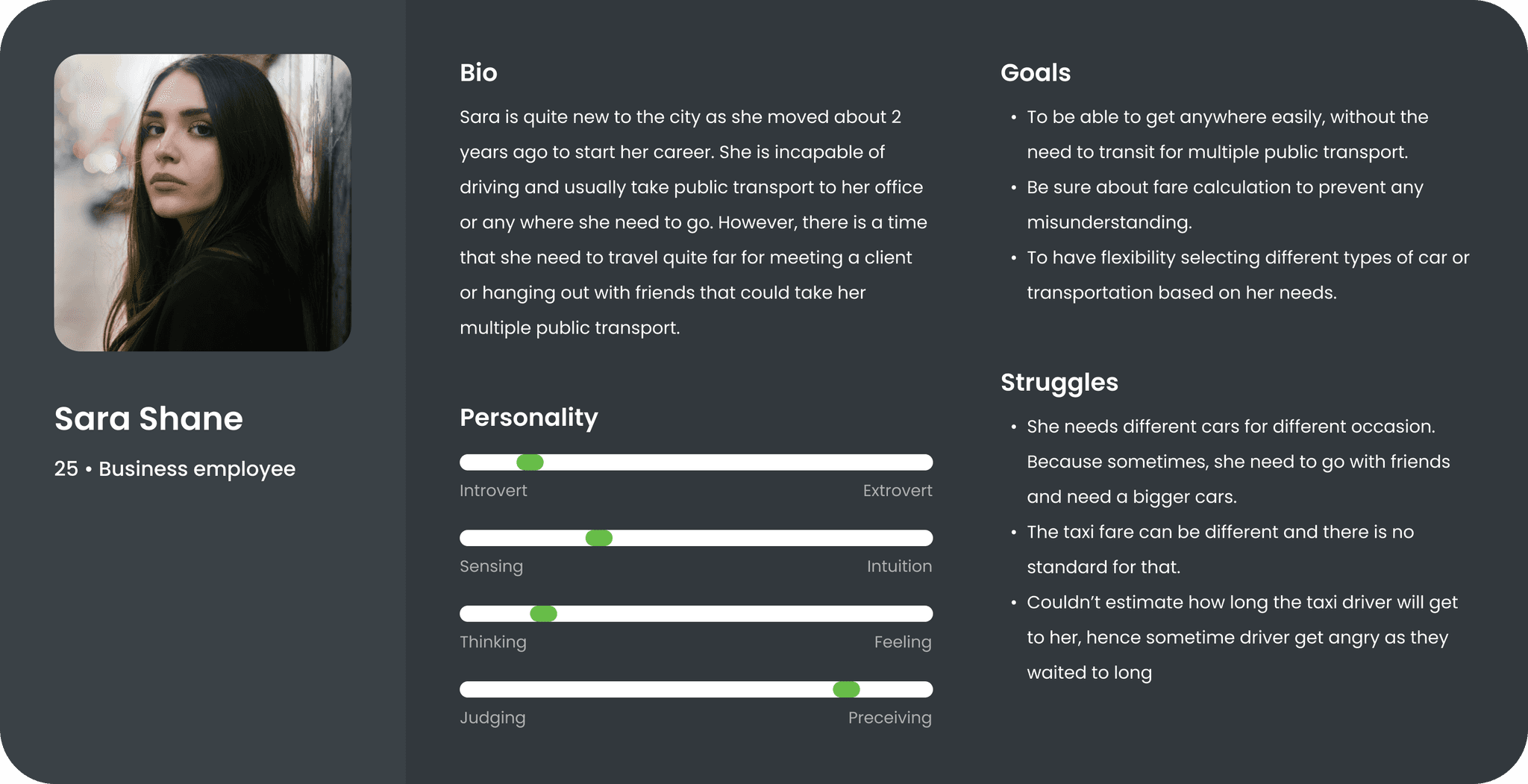
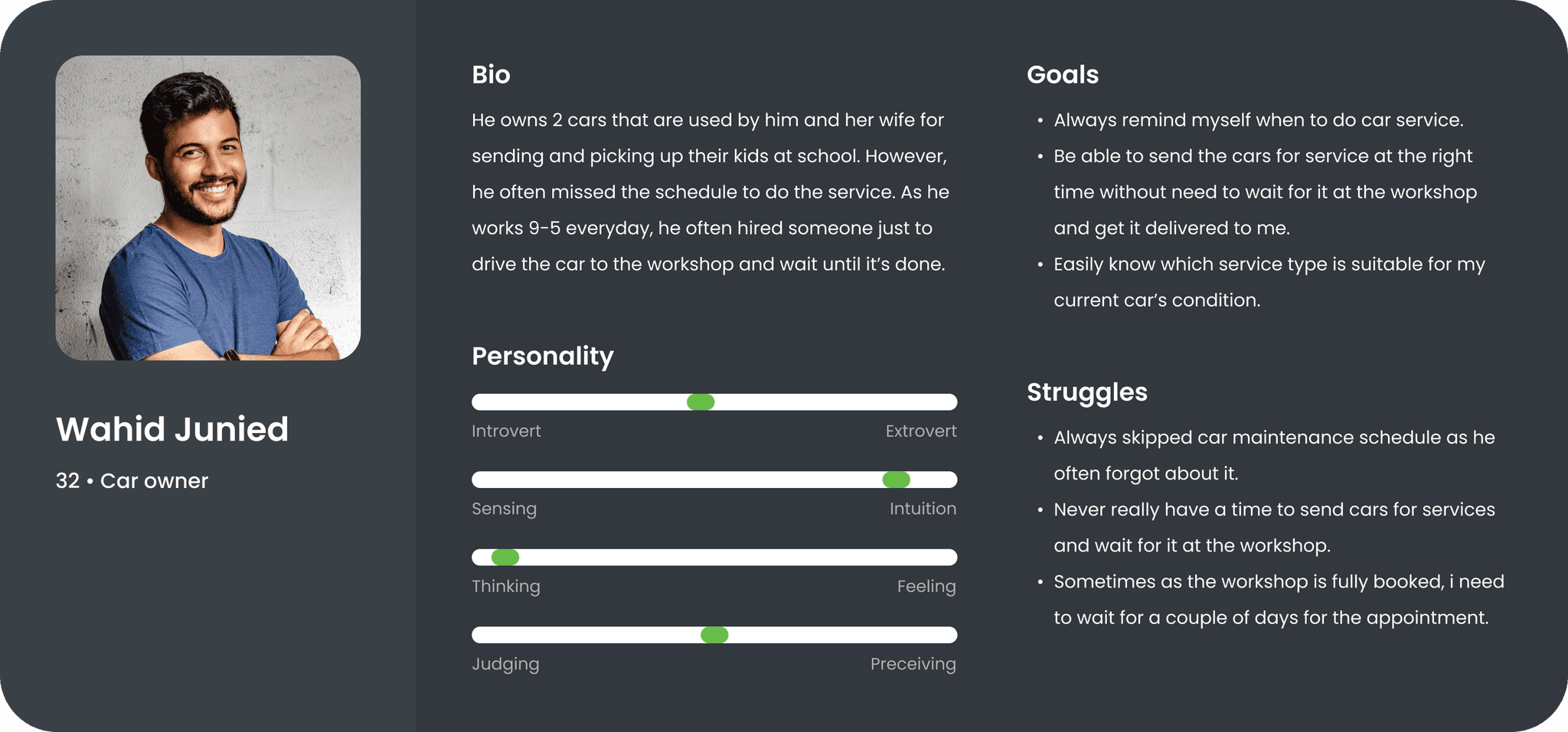
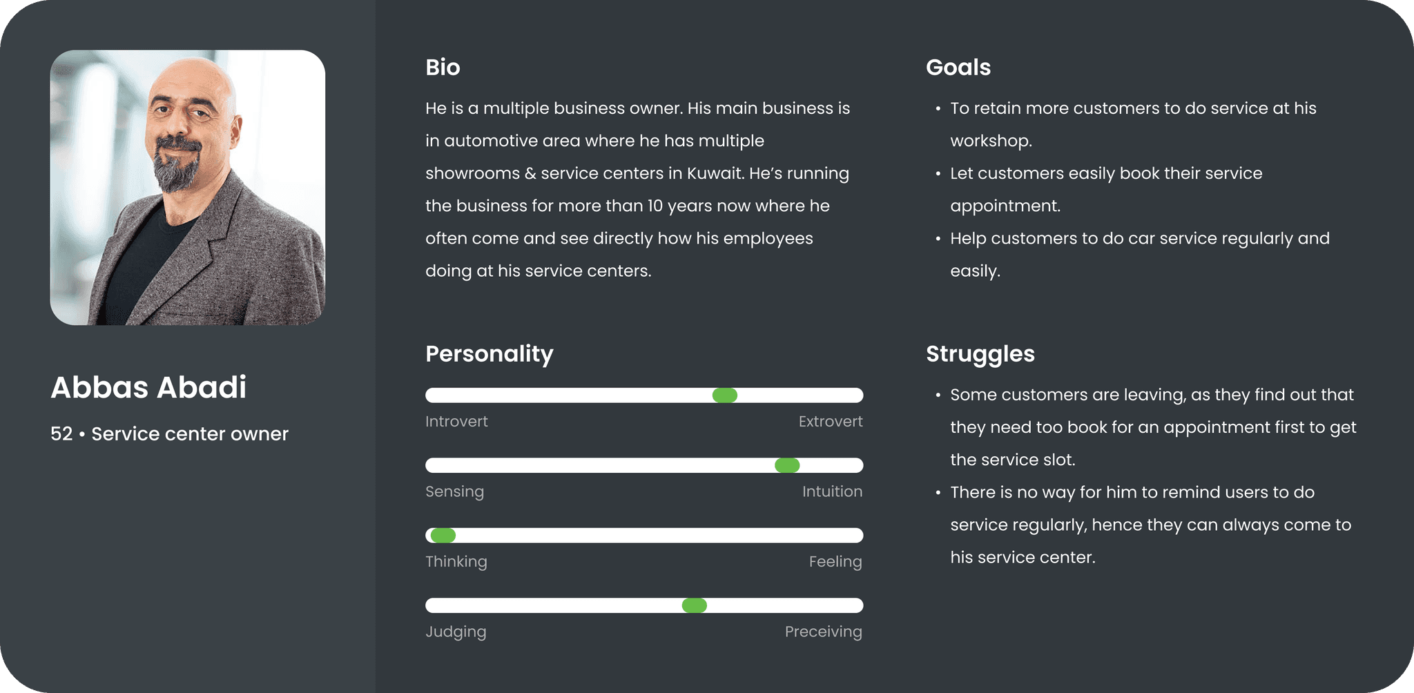
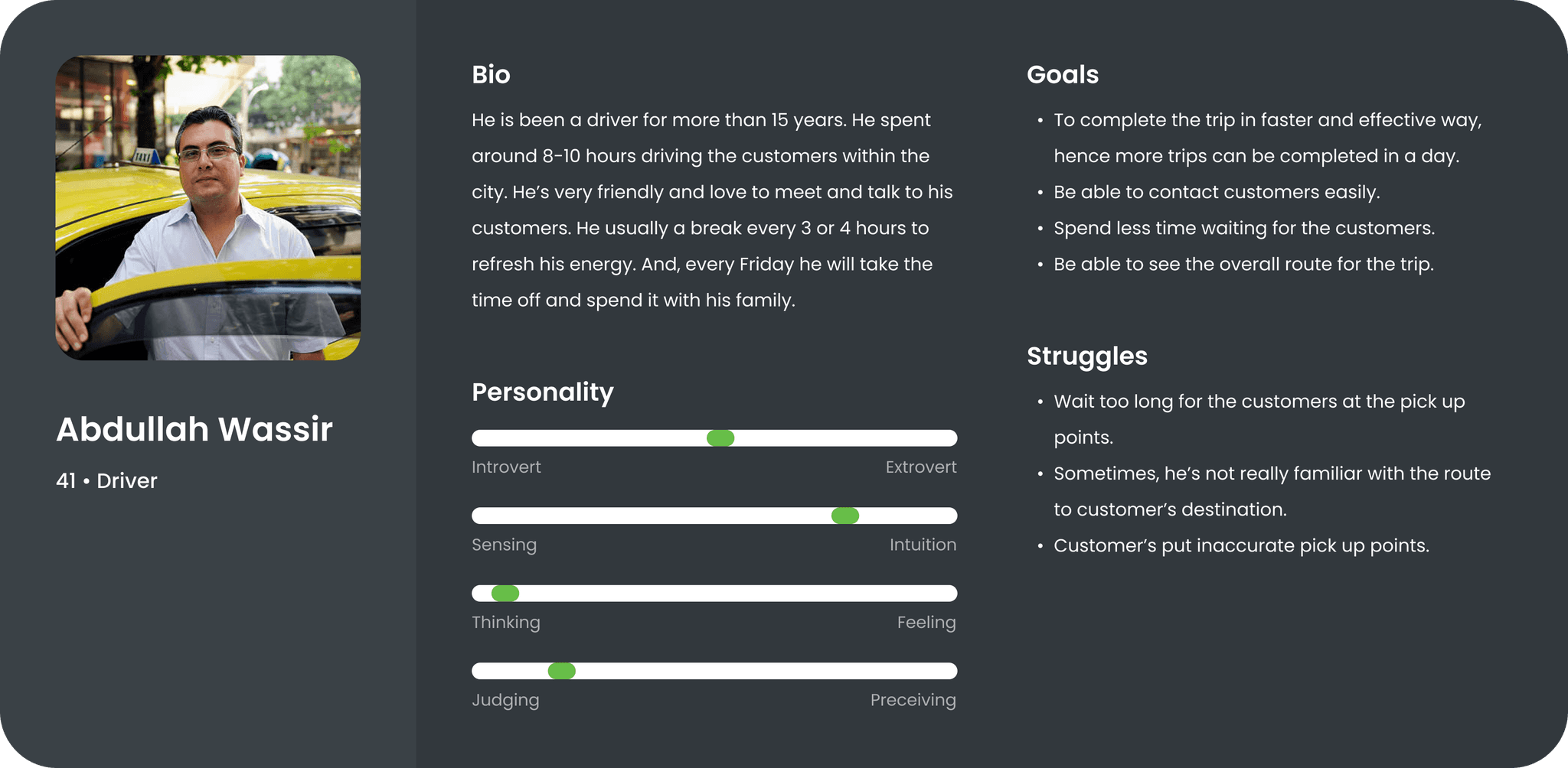
As i already know what will be the user's roles and how the business will run. I then started creating some users persona to let me further understand the need and struggles for some of them. However, i only did it for the main customers, service center owner, and the drivers only as the rest of user's role will be defined more by the operational of the business.
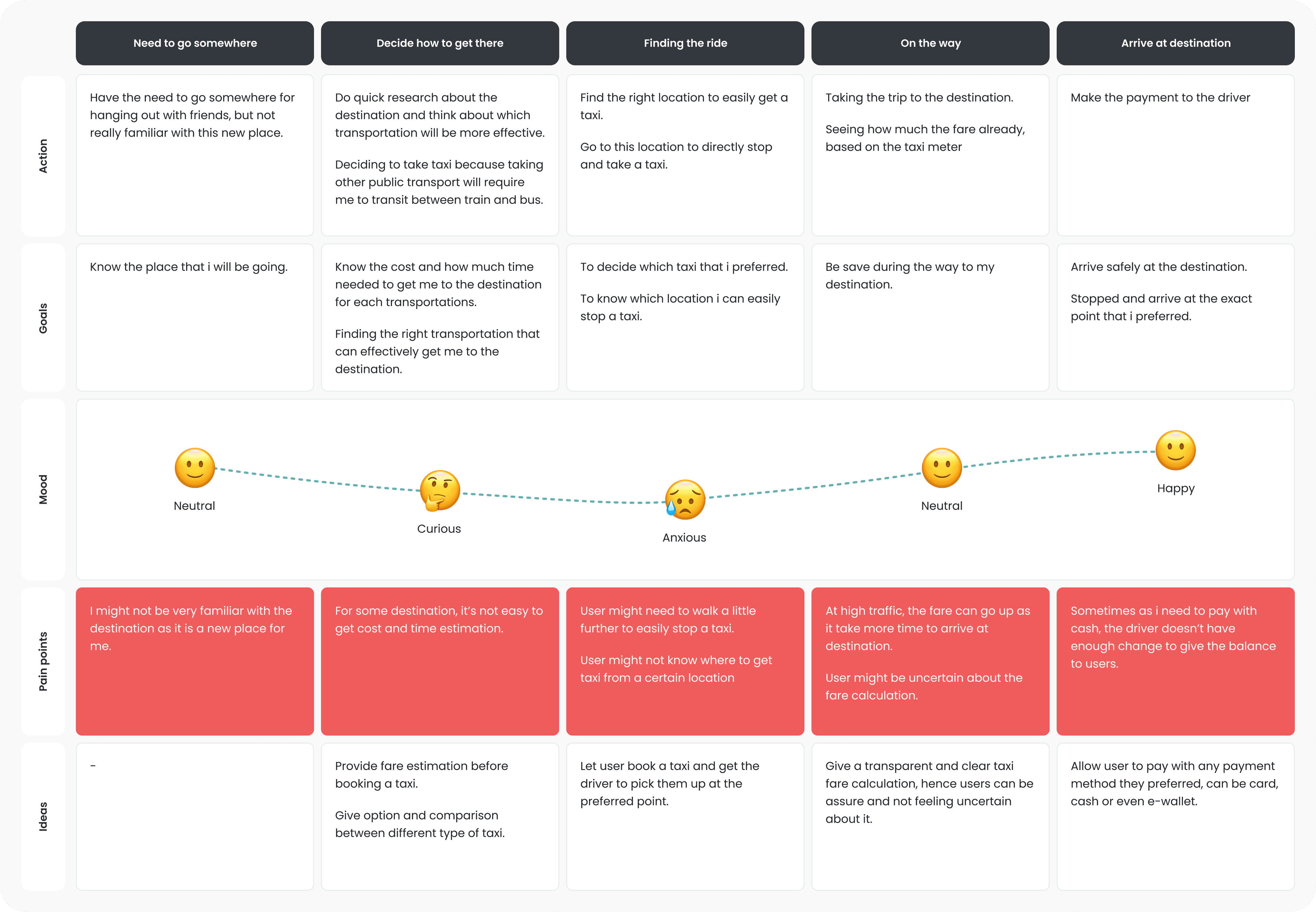
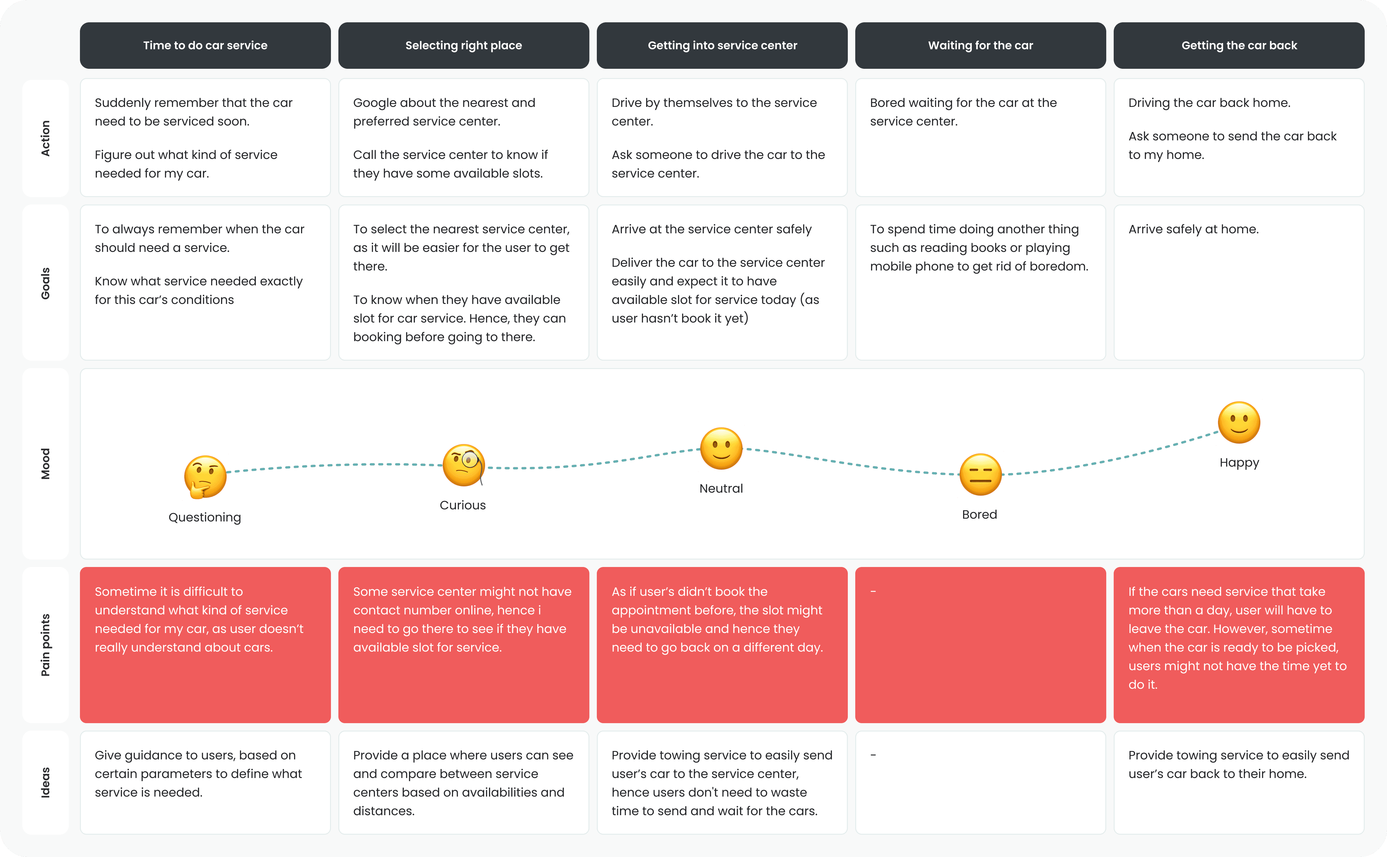
Now, i wanted to understand more the journey that users might take to take a taxi or do car service. Therefore, i created 2 different user journeys representing each of it. These user journeys gave me very clear understanding on what it takes for each of the users to complete their tasks which helped me better defining the solution for them.
Getting a taxi journey
Doing car maintenance journey
Connecting the dots between users
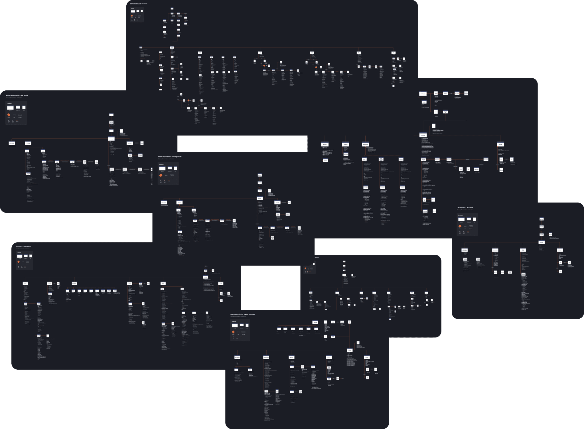
With each of customer’ objective and journey have be defined, i can now decide how these users will connect and interact with each other through their own user interfaces. To do that i’ve created 8 different information architectures and sitemaps that shows what information each of the users will have, as well as how they will navigate through the entire app or dashboard.
See detailed sitemaps
Exploring all the possibilities
To give clear visualization of the proposed idea and solution, the sitemap now transformed into medium fidelity wireframes. There were 9 different wireframes for both apps and dashboard built to give entire understanding of what the interaction & experience will look like.
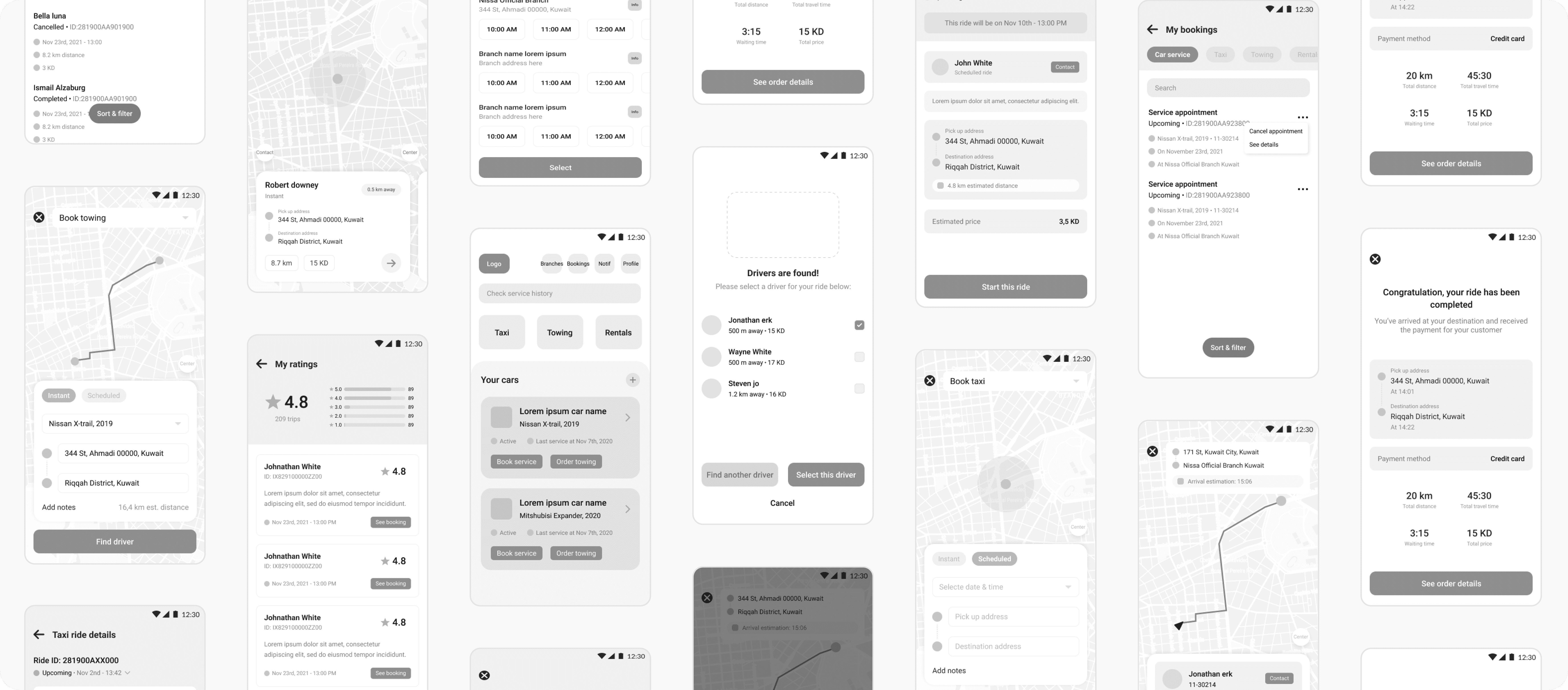
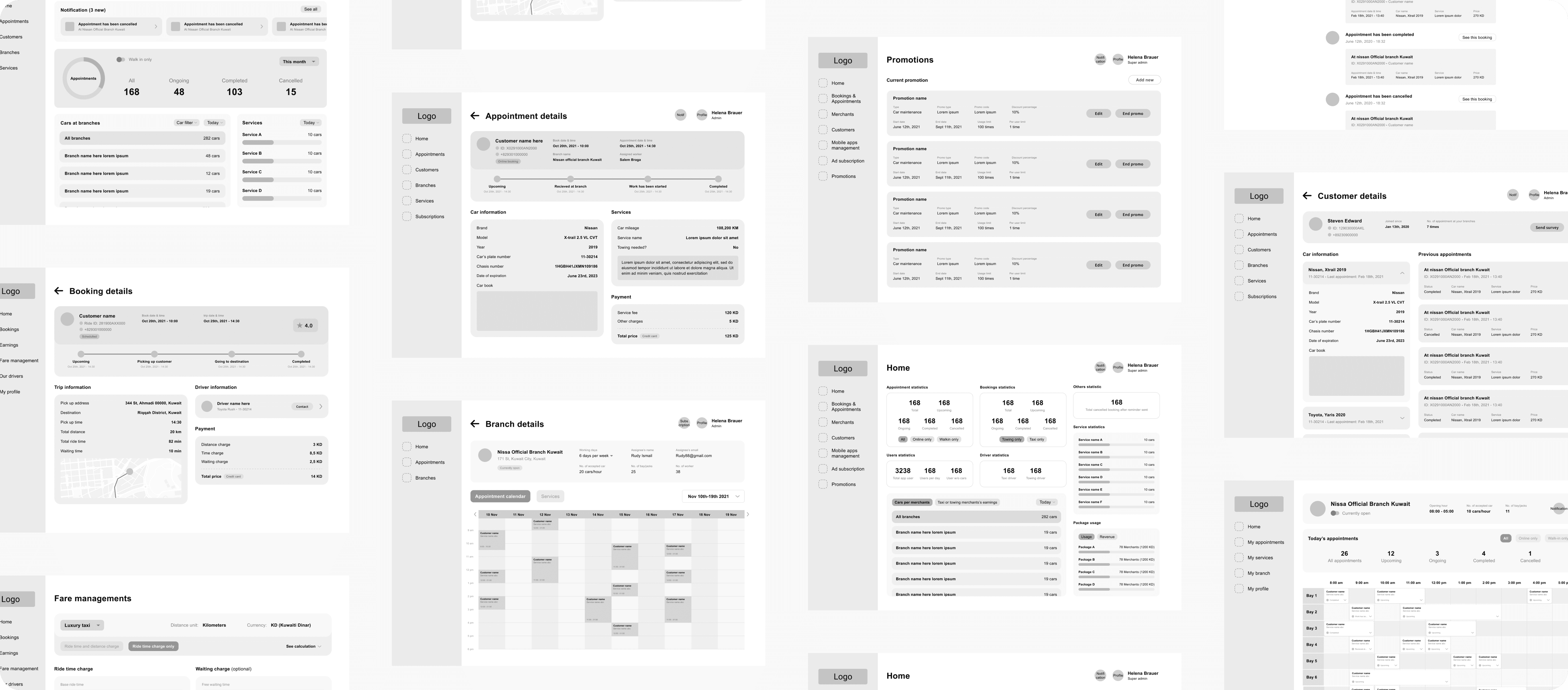
With the ideas & solutions that were getting more visual in the form of wireframe, i started to get some feedbacks from the client. These feedbacks were not only on the interface, but also some communication & consistency.

Making the idea tangible
As my client has provided a green light to proceed with the wireframes. i started by defining the colors, typography, and iconography to give the direction of the UI look and feels.
Primary colors
The client purposely requested that branding should have monochromatic feels on the UI, which mean to use a single color, which we’ve decided to be black and create some shades from it.
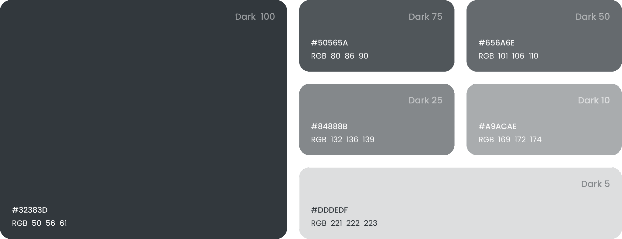
Secondary colors
These colors are used for contrasting the primary color, as well as to be used as negative space or background on the UI.

Accent colors
Since the primary UI is mainly monochromatic, additional colors should be used to provide focus and interest. hence, the UI can better communicate certain type of state or status.

Typography
To compliment the strong and gentle feels of the monochromatic UI, i decided to use bold and sharp typography to emphasize more on the look and feel. While at the same time combining it with secondary typography that has slightly roundness for easier readability.

Customer's mobile applications
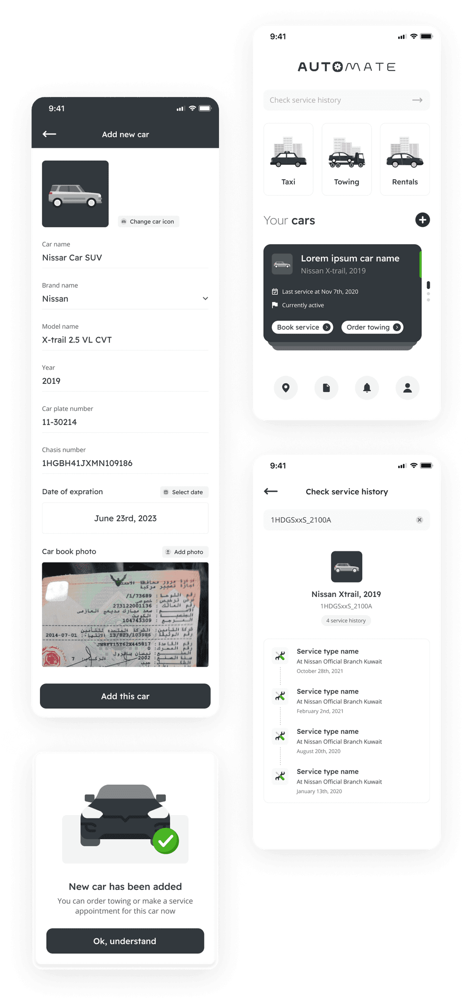
The home page
The features that are available on the home page are organized based on the its importance from the bottom up to allow users easily access the primary items which all related to their cars.
Challenge
How can the app show all cars added in the home page without make it too long. While at the same time, allowing user to quickly completing their tasks.
Solutions
Create stacking card that represent each car that users have added and allowing them to directly do actions from it.
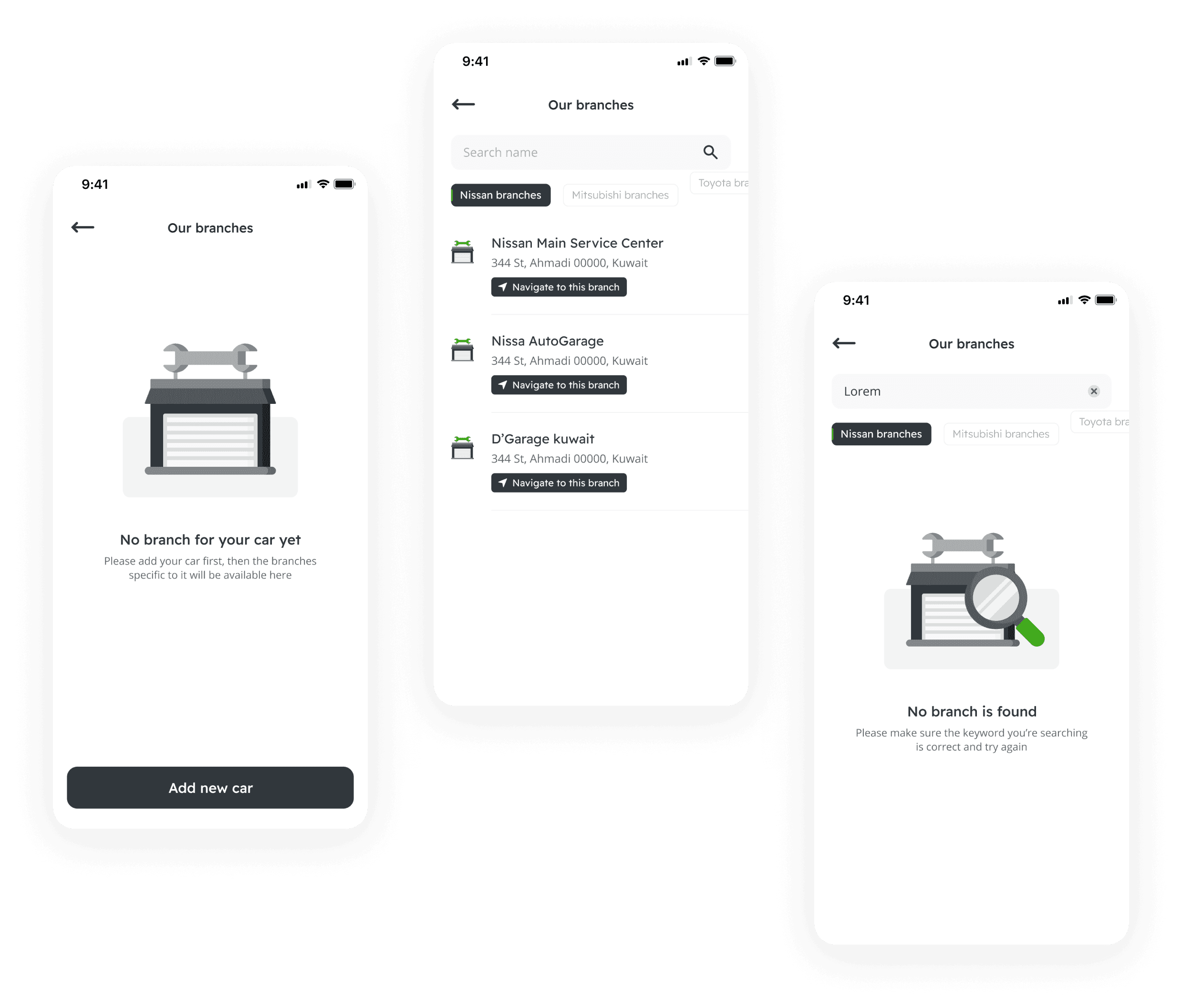
Our branches
The main objective of this page is to allow users to find the available car service center branch based on their cars’ brands. This means users need to add their cars to the app, before they’ll be able to see the list of it. Hence, if they haven't added any cars yet, the UI will show quick action to add car.
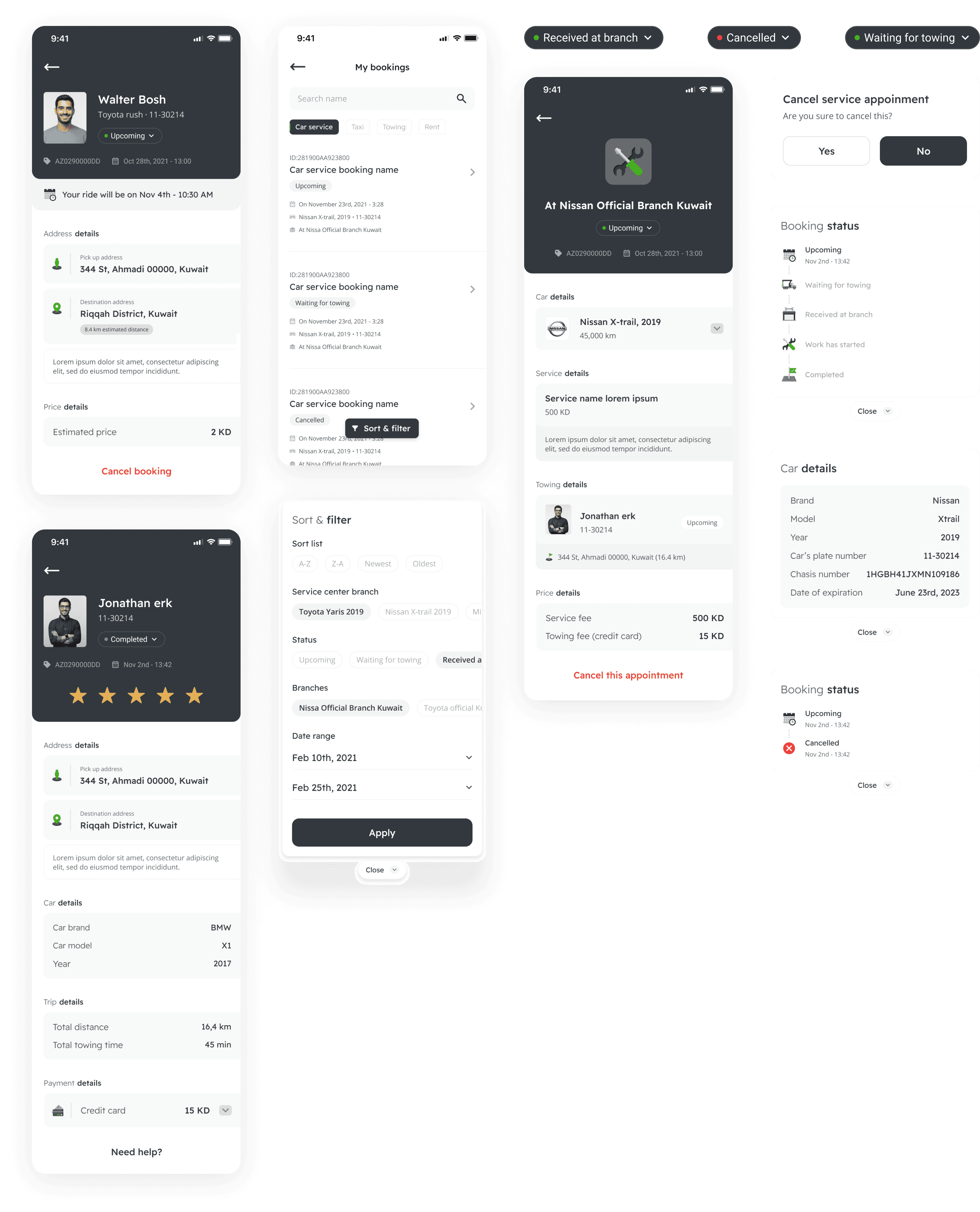
My booking page
This page serves as a place where user can find their ongoing or completed booking for all types, which are service appointments, taxi bookings, towing & rentals.
Challenge
How can we unify all user’s booking without scattering all type and status that it might have.
Solutions
Add clear grouping and organization for each booking, as well as limit the amount of information upfront to just enough for user to differentiate and find right booking.
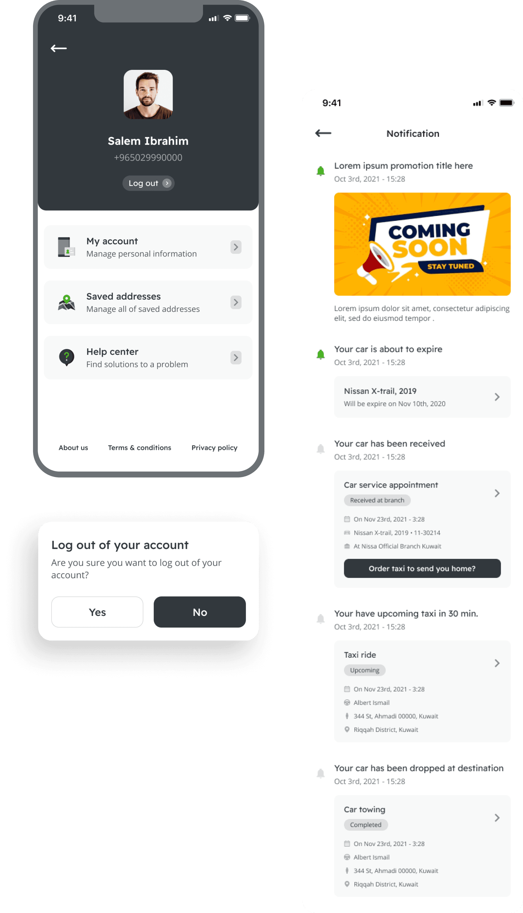
Notification & profile page
Multiple type of cards are created to accommodate the need for each booking status, actions and informations that are sent to user's notification page.
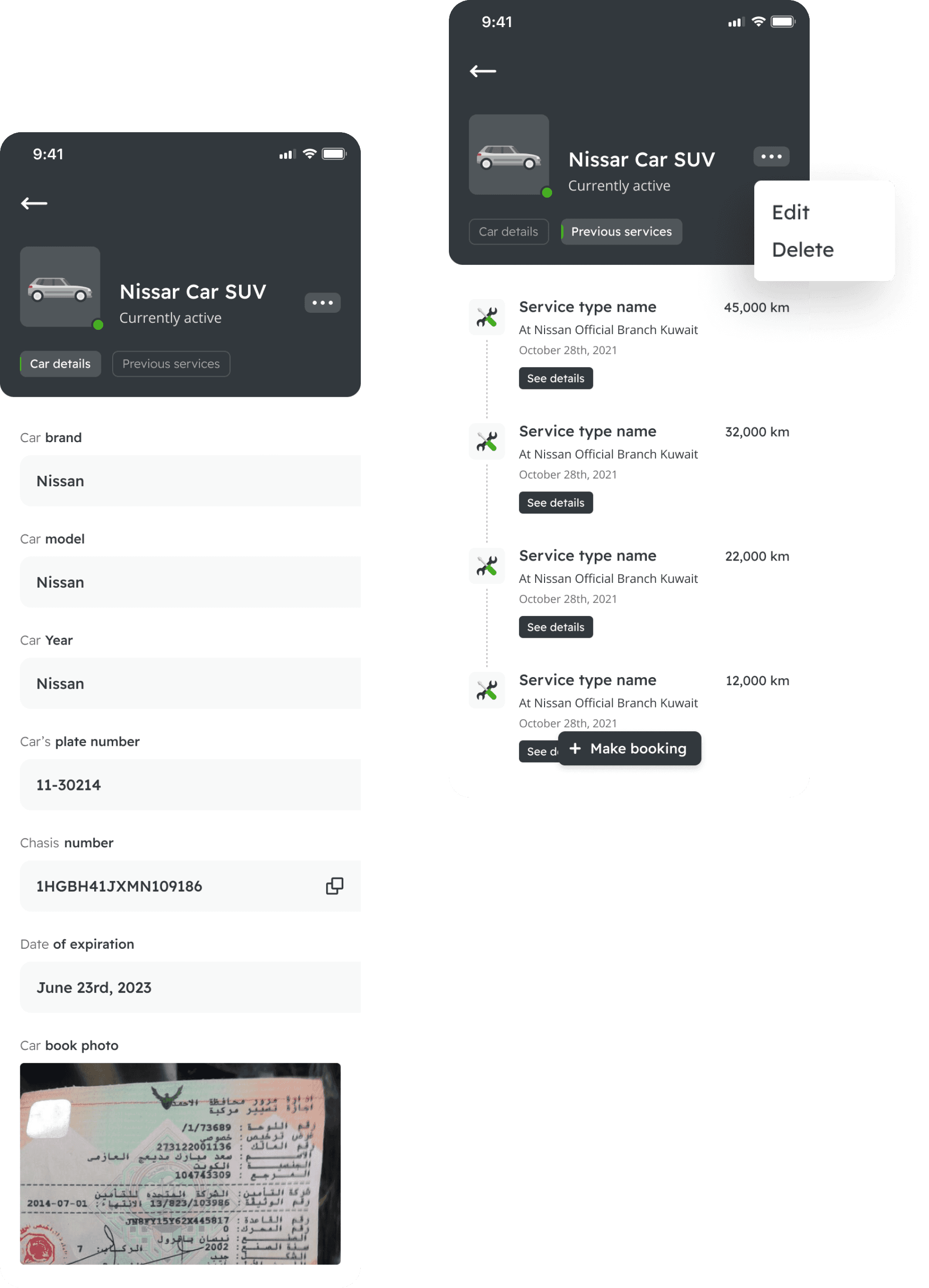
My car's details
User’s car will have 2 main information (details & completed services). To organize it better, these 2 information are grouped by using tab in the page. Since the main objective of having car in this app is to book service appointments, hence allowing user to directly book it from this page will help users in cutting their steps.
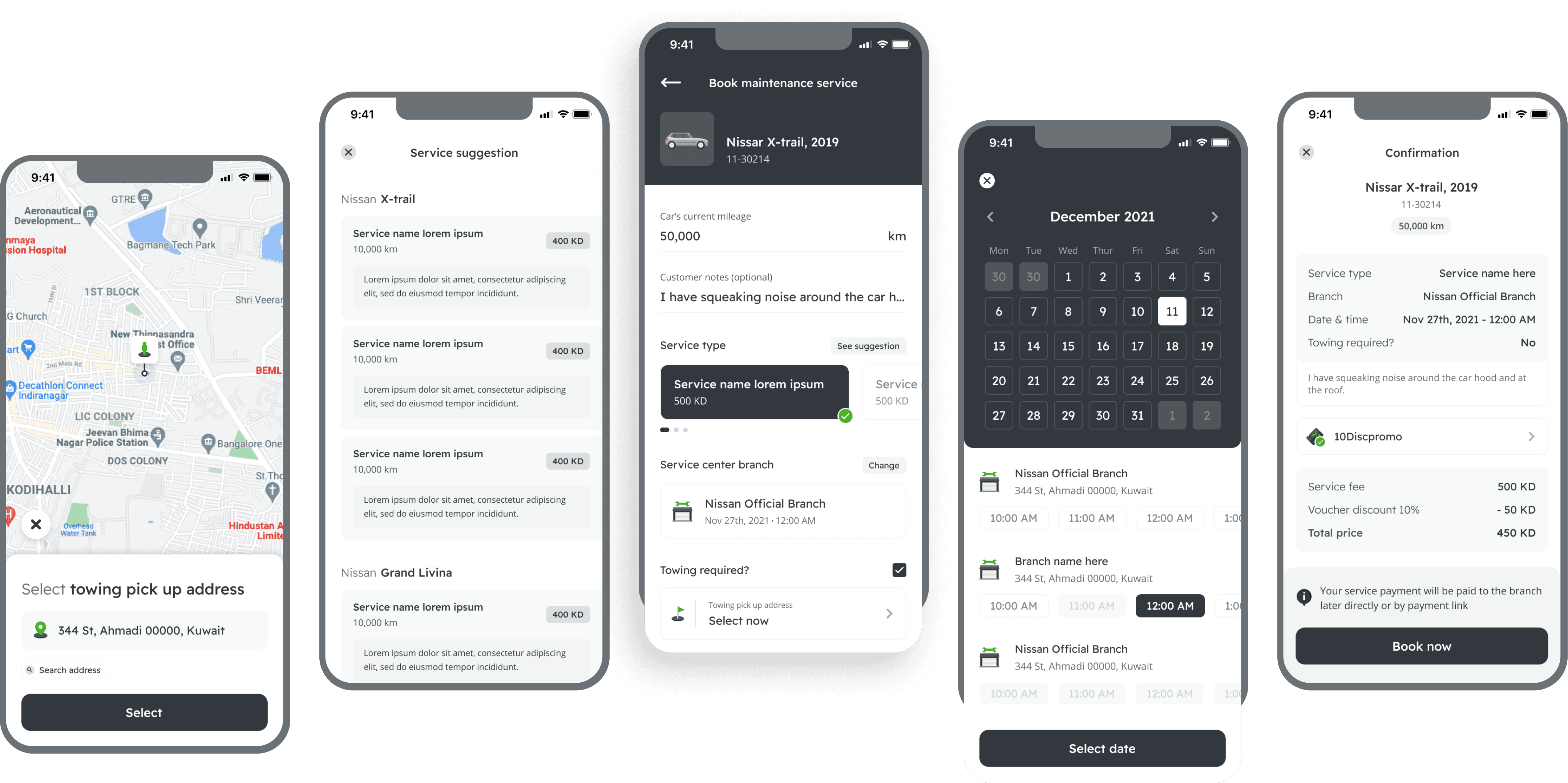
Booking an appointment
When booking a service appointment, user will have to input car’s mileage and select the available branch based on the date selected. User will also have an option to request for towing for sending the car to the service center.
Challenge
Due to the technical limitation of not being able to identify and select the service type automatically, how can we help users to be able to select the correct service type.
Solutions
Show suggested service types based on the car’s brand with its description, mileage and price.
Driver's mobile applications
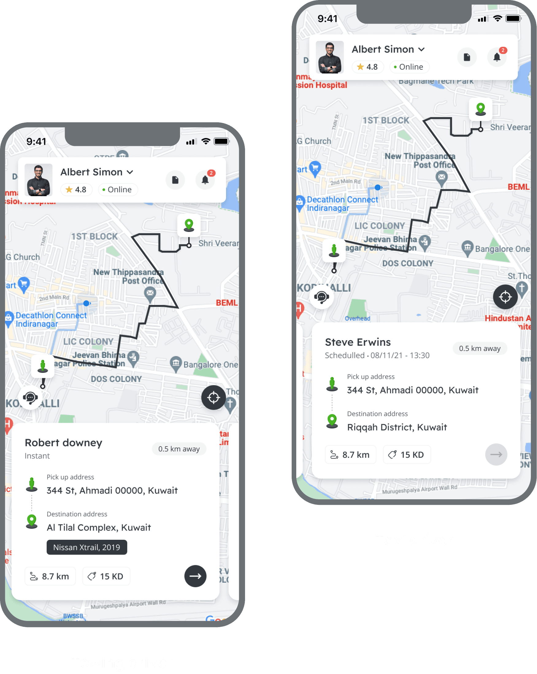
The home page
There is not much different between towing & taxi driver application, as their objectives and task is the same. Hence, i tried to keep every thing the same as much as possible.
This home page is designed to allow drivers to be able to focus on completing their trips, therefore the other feature or menu is hidden and the home page become the primary map for them.
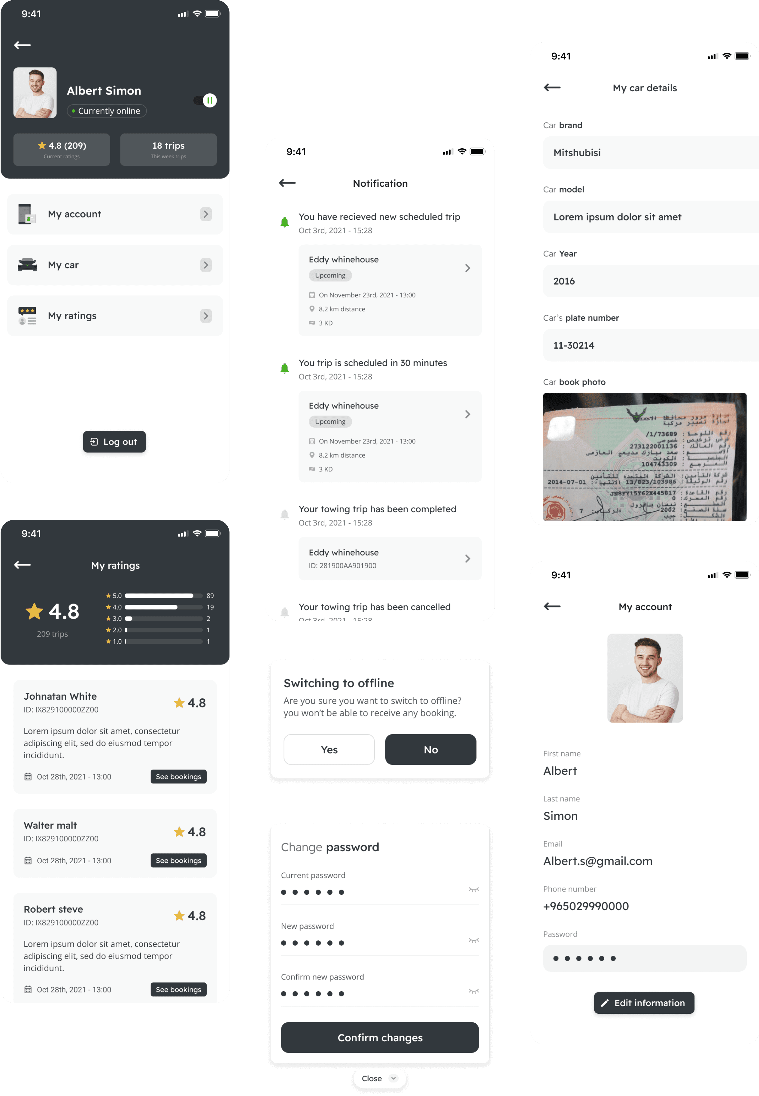
Driver's menu
The driver application only has 2 main menu beside the main booking menu which is profile and notification. This is to make sure that the driver application is simpler and straight forward to be used.
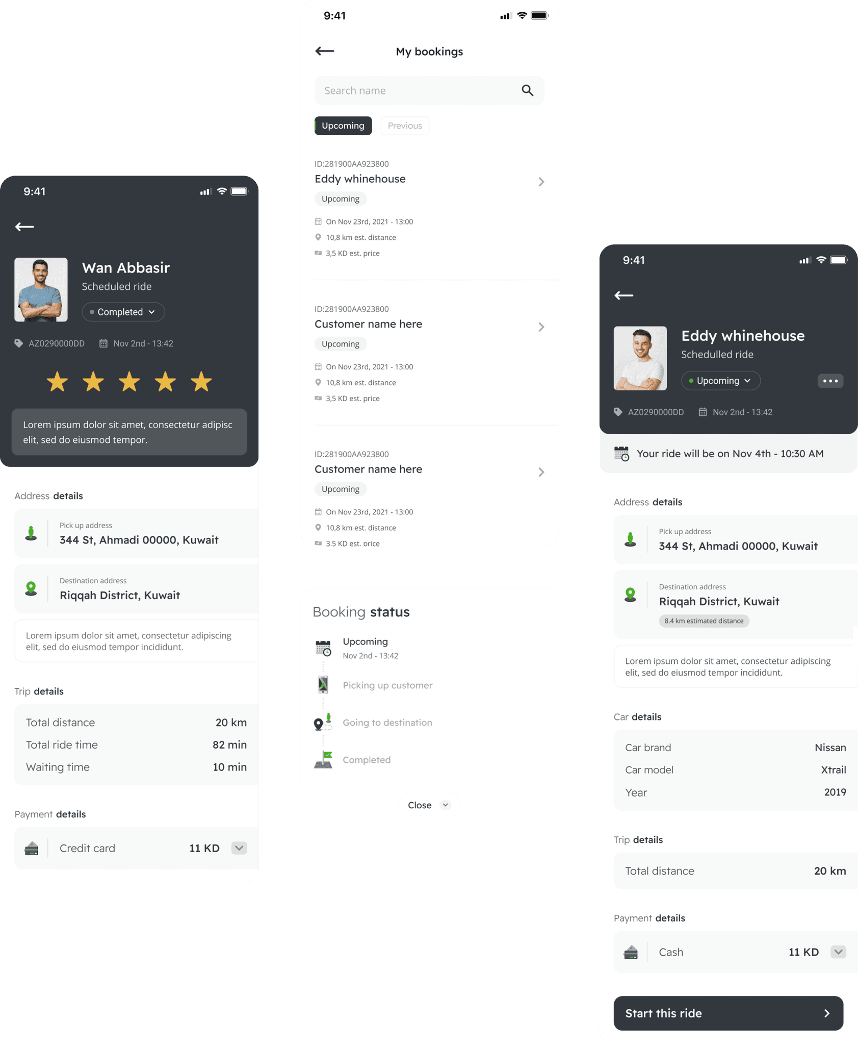
Driver's booking page
Upcoming, completed or cancelled bookings are placed on this page where drivers can see the details or even start the upcoming bookings.
Connecting customers to the drives
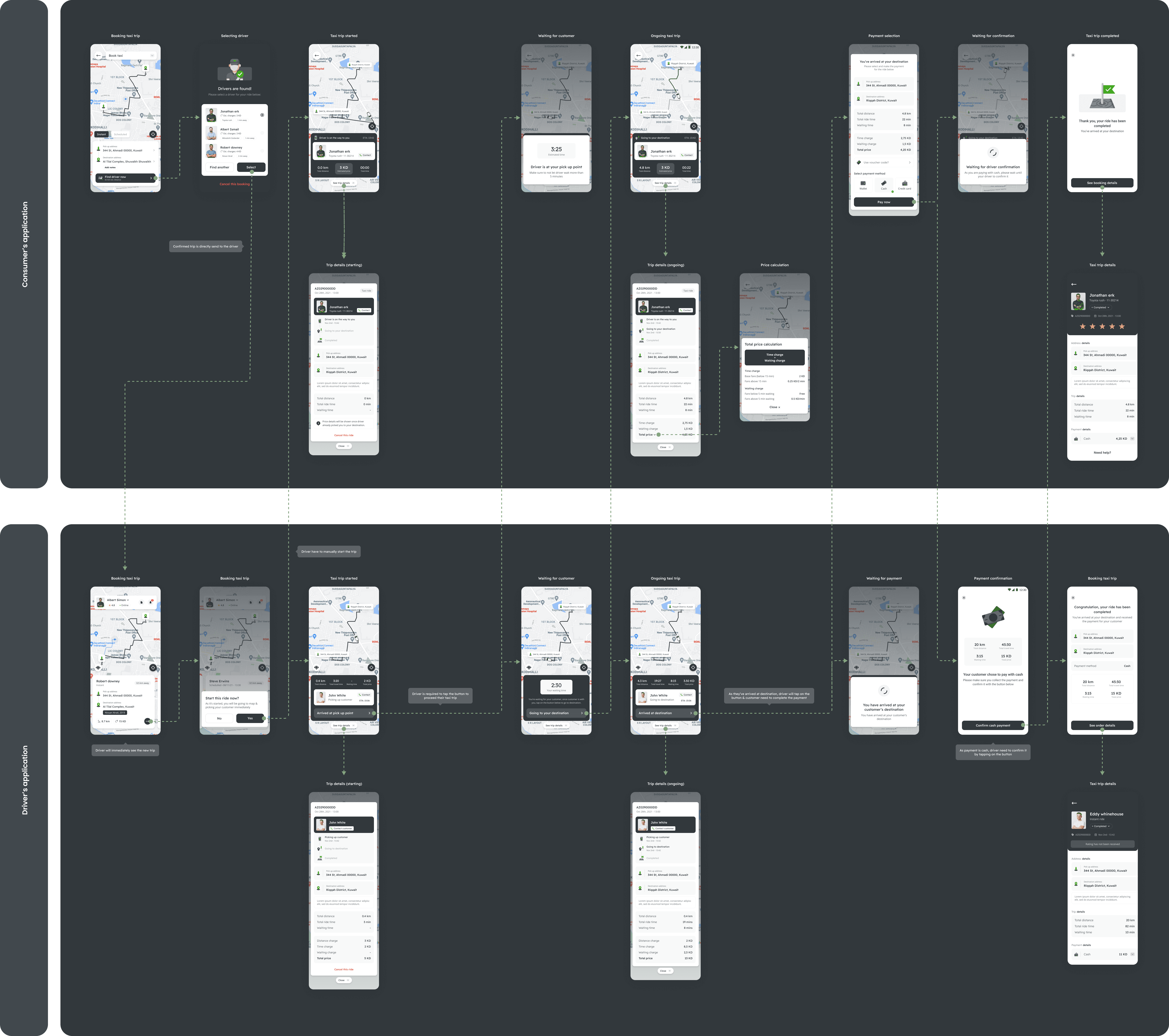
The secondary service that this application provide is on demand taxi service, towing and rental (for future development). In order to give customers the best experience, taxi and towing driver will have their own mobile applications.
The driver will be able to receive instant or scheduled trips directly to their home page when customer just selected them. From there, driver will have to tap on multiple buttons through out the trip start and proceed the trip until they reach the destination.
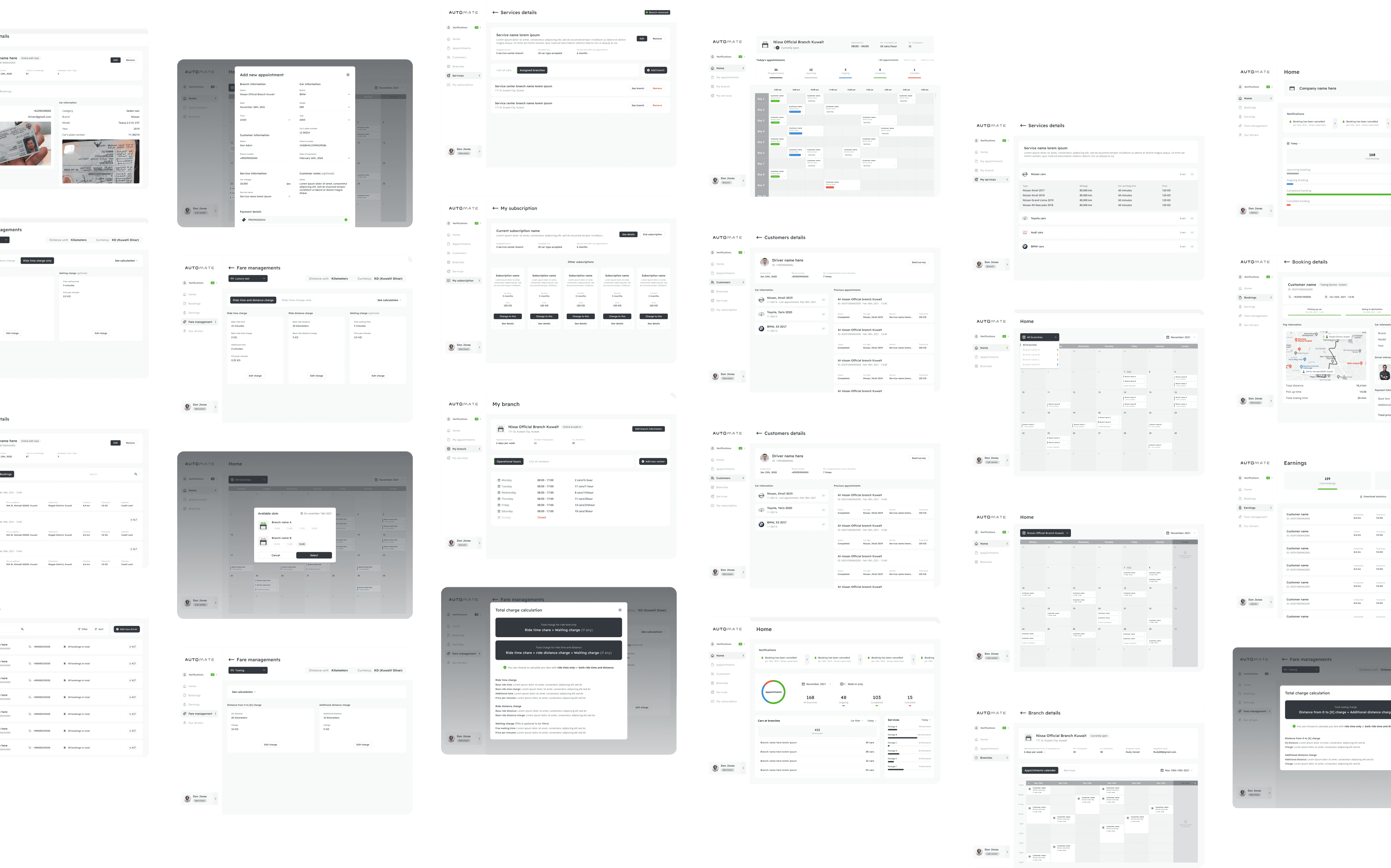
Admin & merchant's Dashboard
Super admin home page
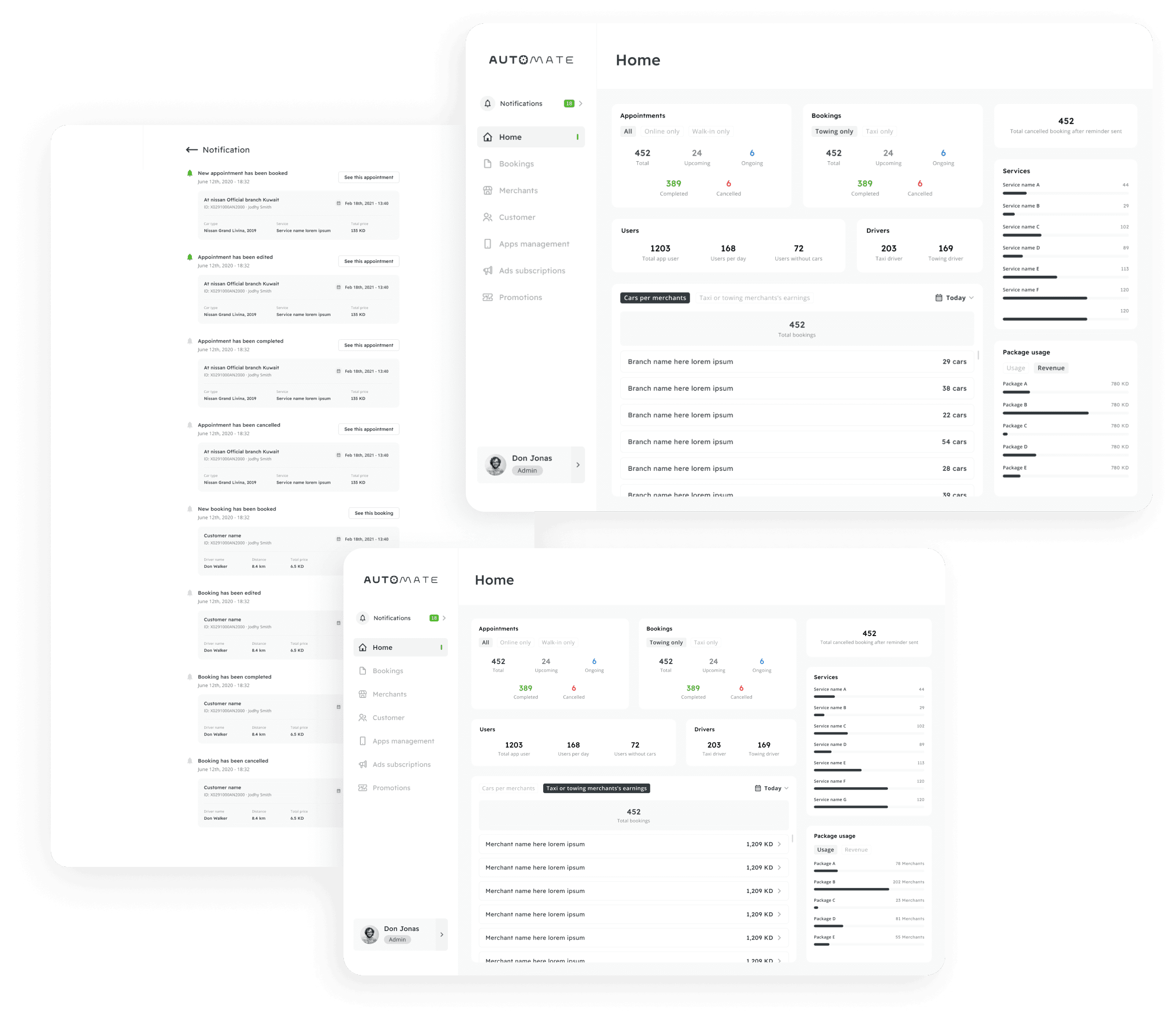
Super admin has capabilities to overseeing the entire operation of the business, as well as managing the users (customers, merchant and drivers) and the platform itself. Therefore, the home page of this dashboard should contain all the statistics and insight that can be gathered to give the overview of the current running business.
Overseeing the bookings
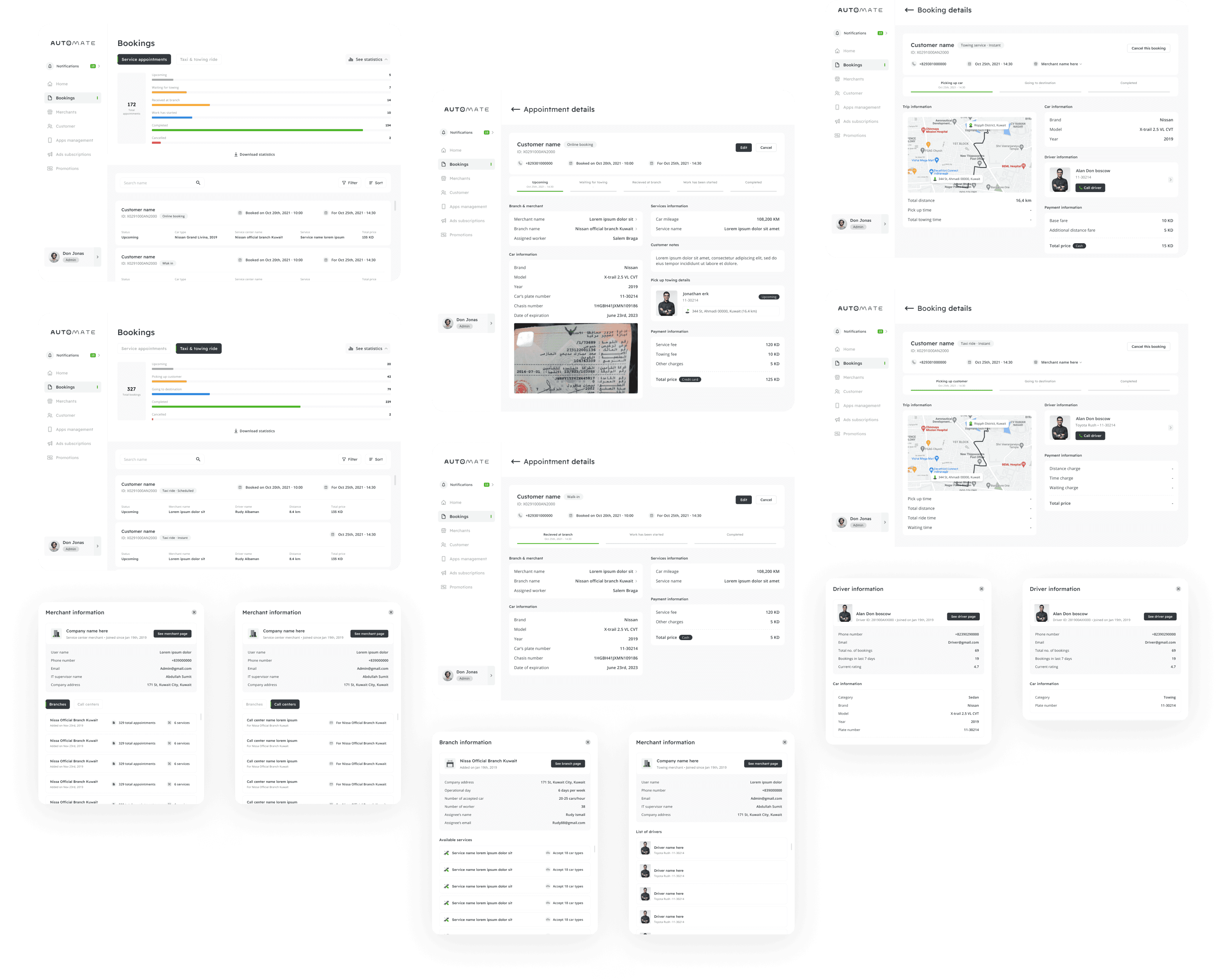
There will be 2 type of bookings which are the service appointments and taxi/towing bookings. Each of this has its own details information that the super admin can look at, including the merchant, branch or driver that associated with it.
Merchant & branch page
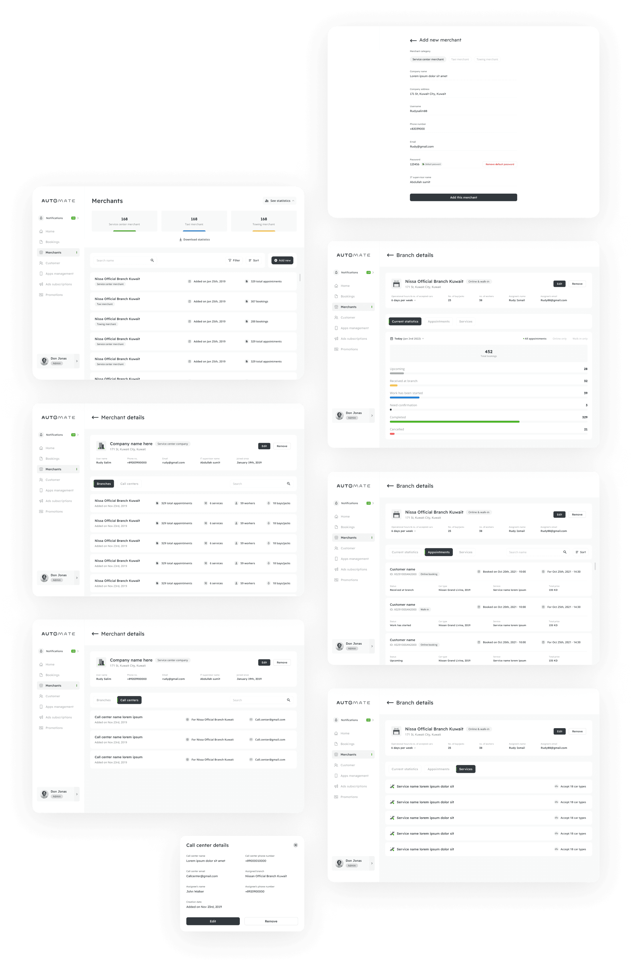
Any merchant that just joined the merchant, will be added by the super admin from this page, then the merchants will be able to add their own drivers, branch or even call center from their own dashboard. This is give the super admin the authority to oversee and manage all the merchant in the business.
Customer page
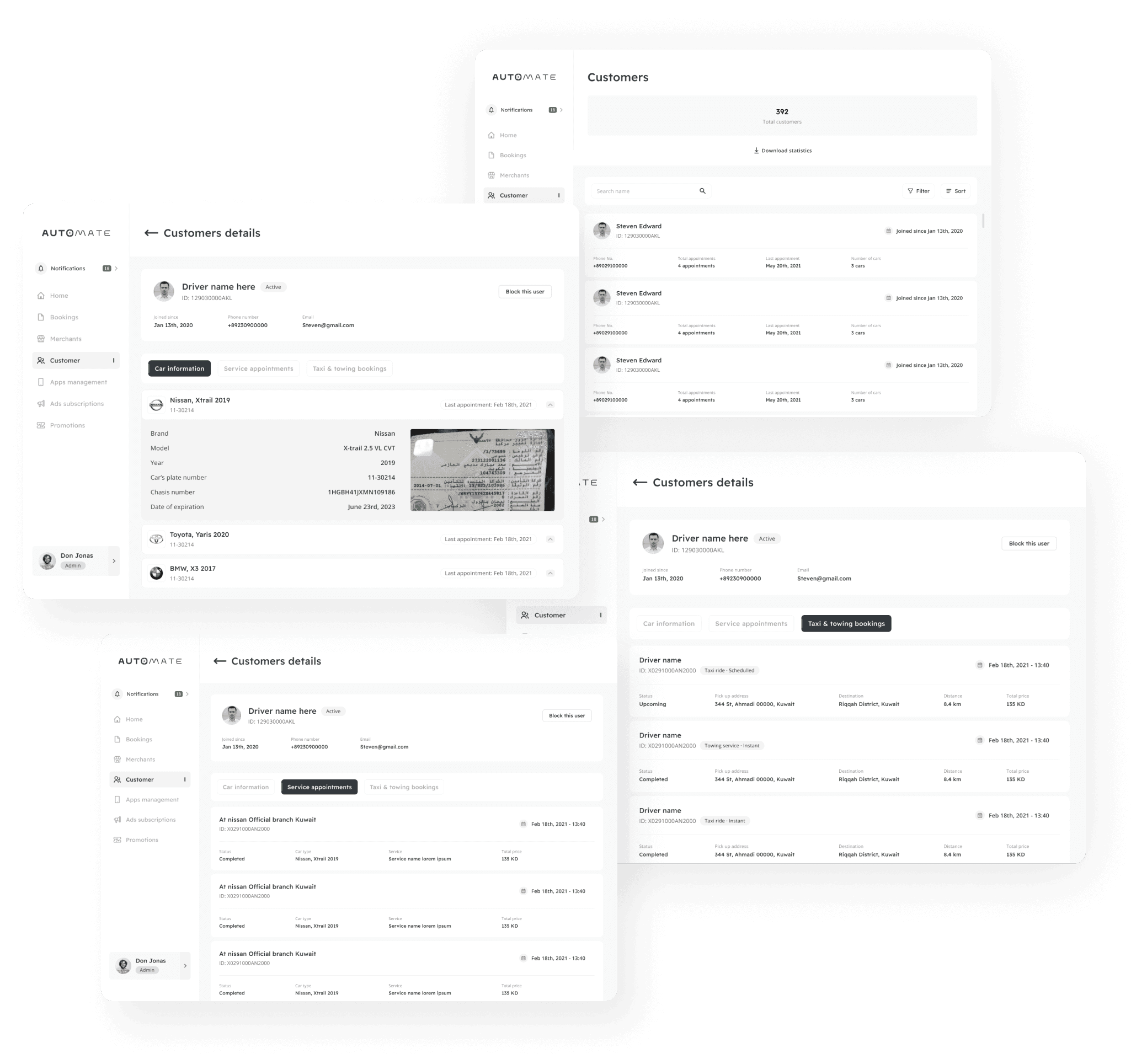
As new customers (users) just signed up through the apps, it will be reflected on this page. The super admin will have the capabilities to see the details of it and all bookings that this user has made, as well as the cars they owned.
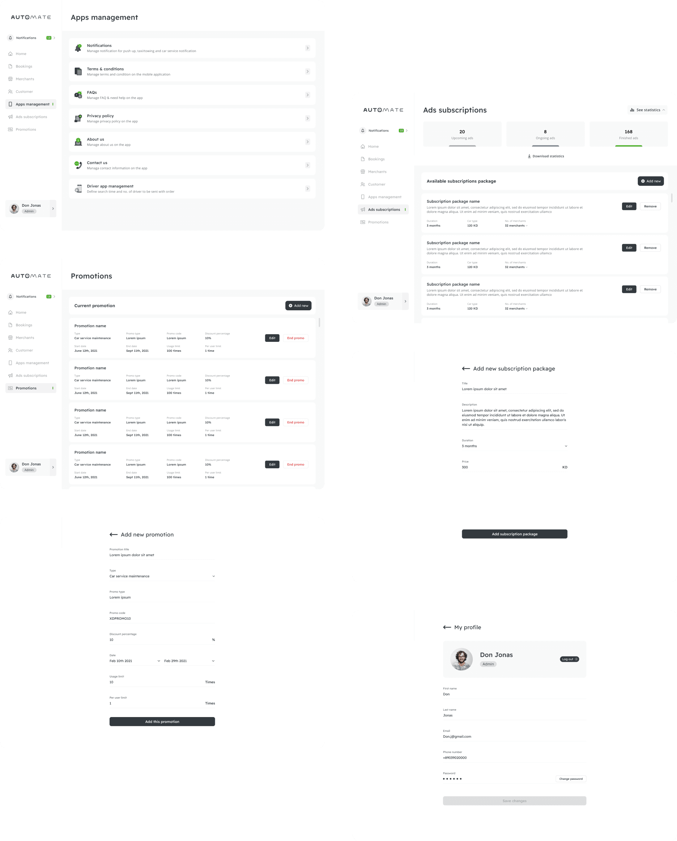
Other menu page
This pages give the super admin the authority to manage all in apps related contents and promotional stuffs.
